Skip to content

Fratelli Lunardi / New identity

Fratelli Lunardi

Look tasty and smell good!

strategy – rebranding – creative direction – copy strategy – illustration – packaging design – web design&content – digital content – editorial design

Who tried the biscuits by Fratelli Lunardi knows how tasty they are. Have you noticed how beautiful they are now?

A new identity, a new trademark, thanks to restyling, and a new communication system. All made in almagreal.
The main characters? Two brothers, a family-run business, one common passion. A dynamic system where colours and illustrations are key points.

If you say Lunardi, you mean brothers.

The smell of freshly baked bread accompanies Massimiliano and Riccardo from their childhood. When you get used to that aroma you cannot – and don’t want – to live without it, anymore. Their story is a combination of passion and tradition, a bond that goes beyond brotherhood: is the natural inclination and respect for the family business. The first time we listened to their story we immediately understood we were spectators of something unique that we needed to narrate through words, images and colours.

Feast your sweet eyes!

We revolutionised the whole brand identity of Fratelli Lunardi: a new trademark, visual identity, packaging and website. We developed a strong and recognizable brand image and designed – along with the new logo – a system of connected and interconnected elements. Graphic signs and illustrations, headlines and pictures to feed a multi-platform communication universe.

Biscuit or eye?

Good to eat, beautiful to see. Because who says Lunardi, says beauty, too. And the biscuits by Lunardi are to eat with your eyes first. Two small eyes? Two biscuits? This is the question.
Look how beautiful they are!

Look around!

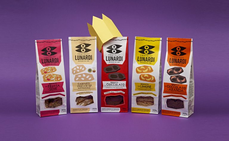
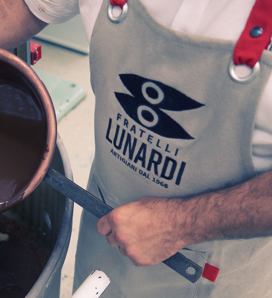
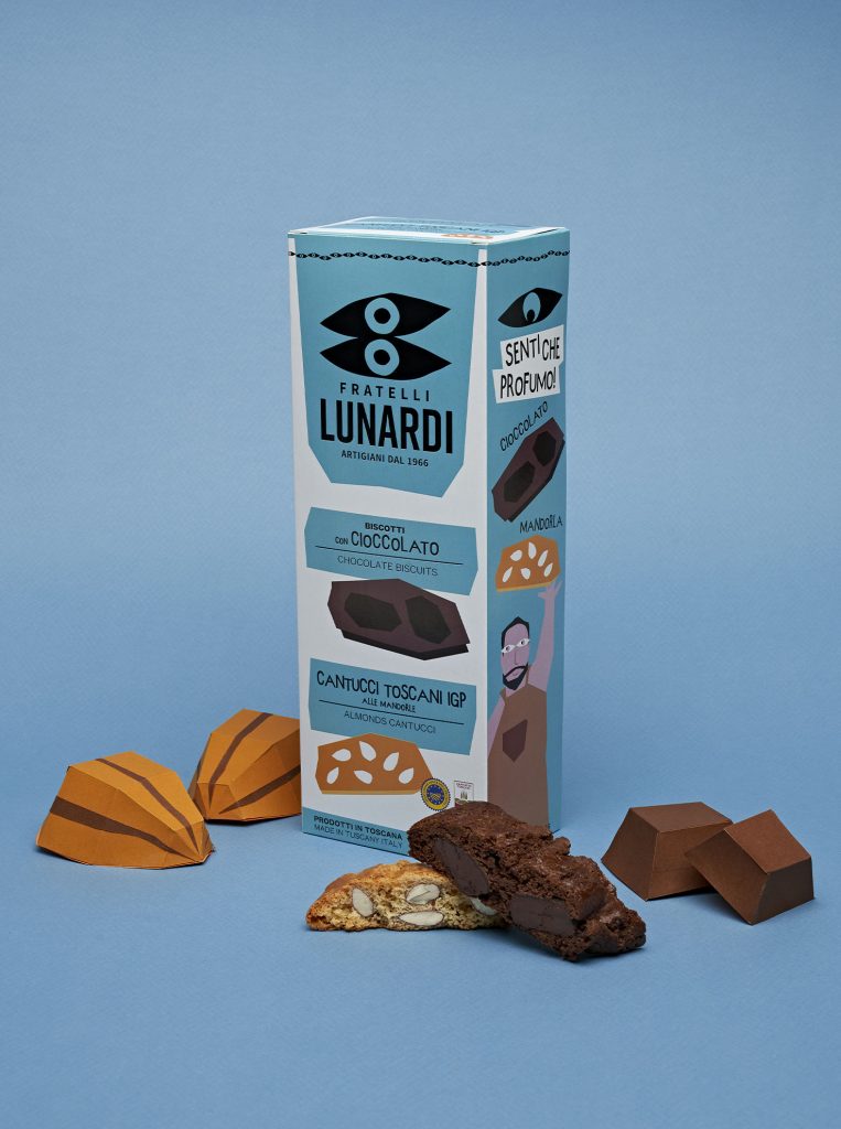
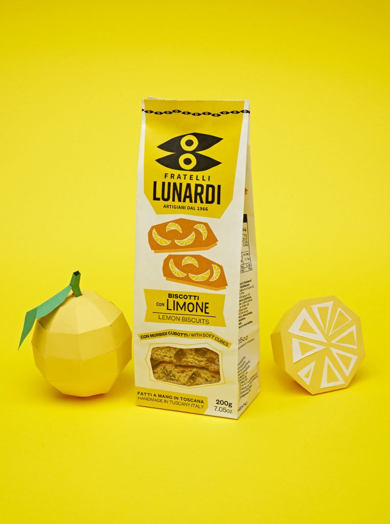
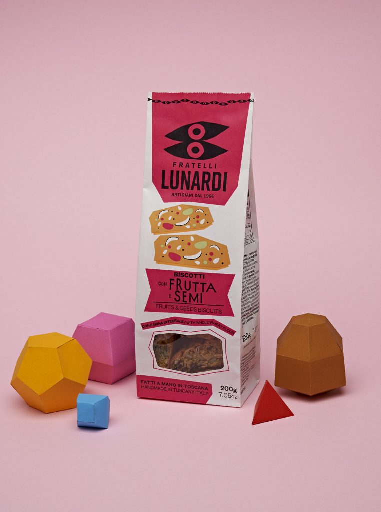
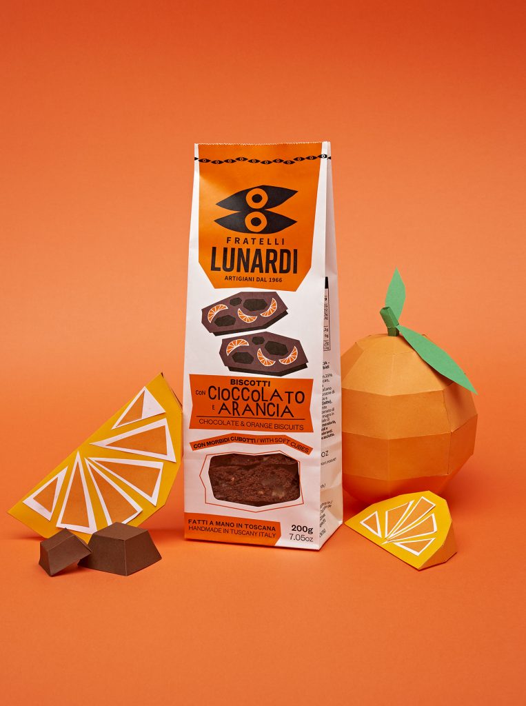
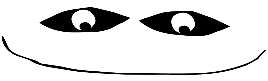
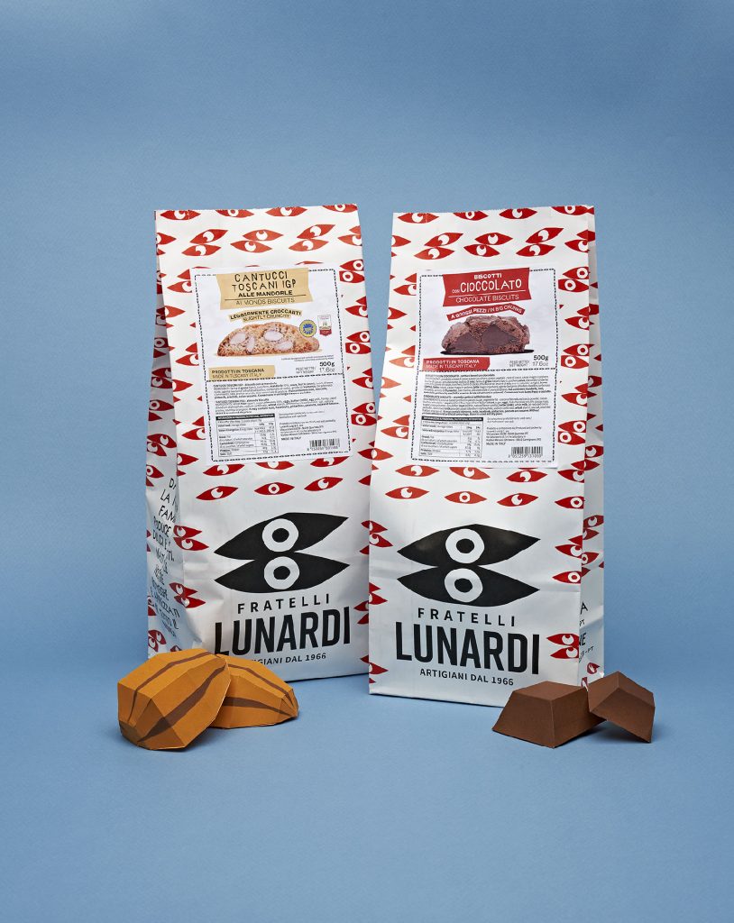
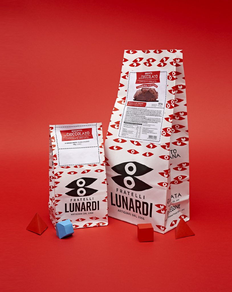
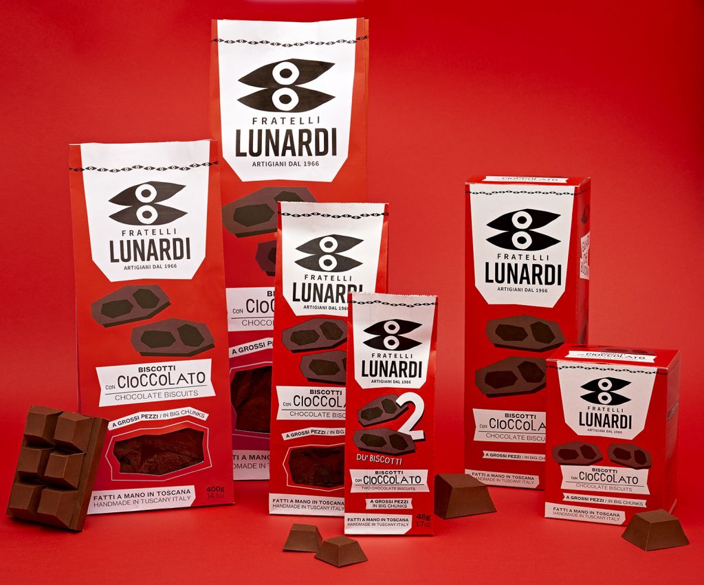
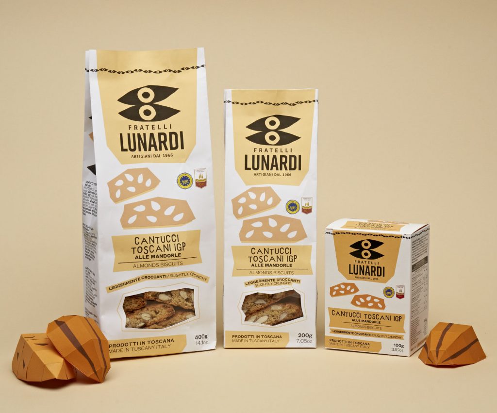
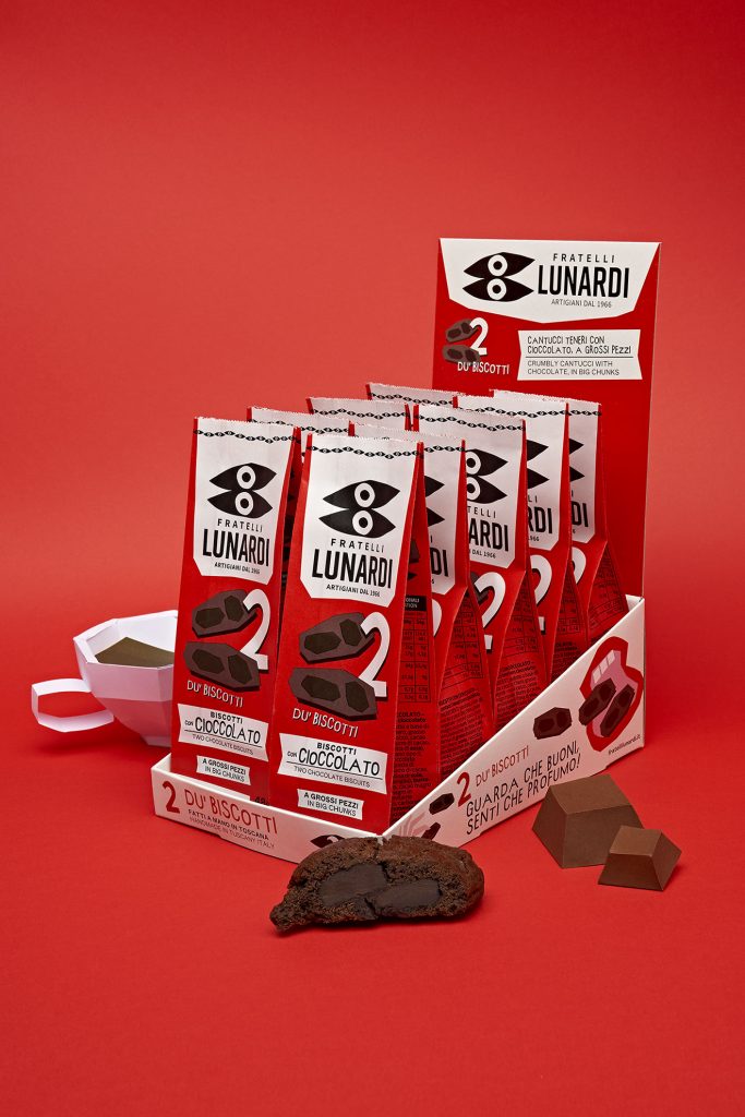
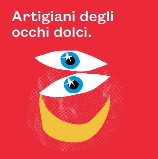
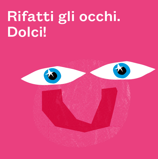
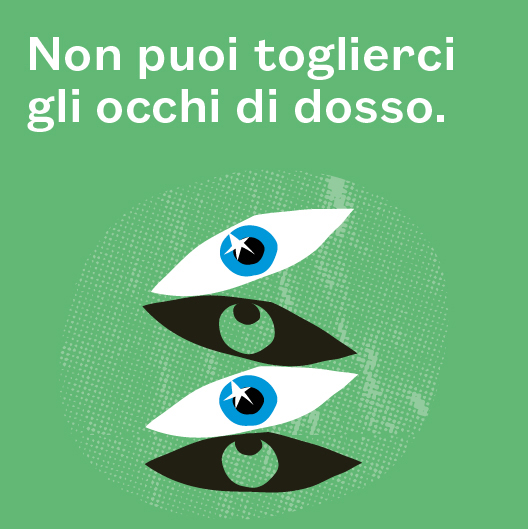
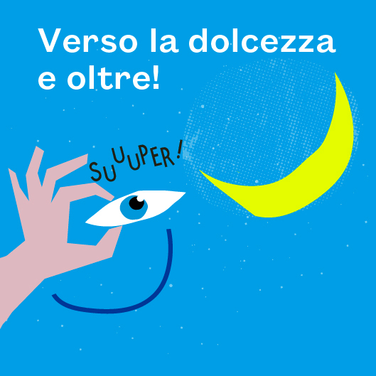
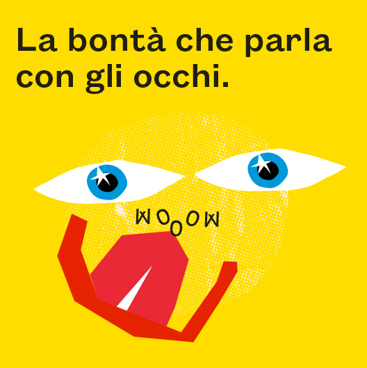
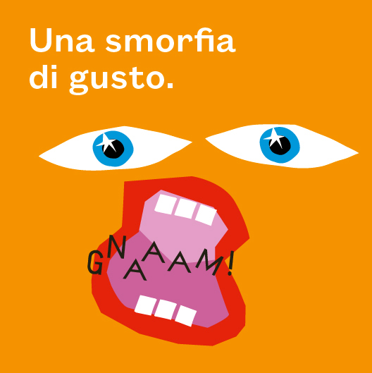
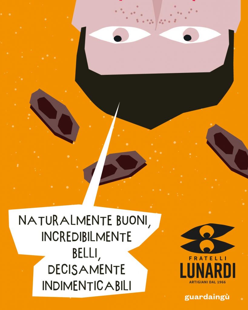
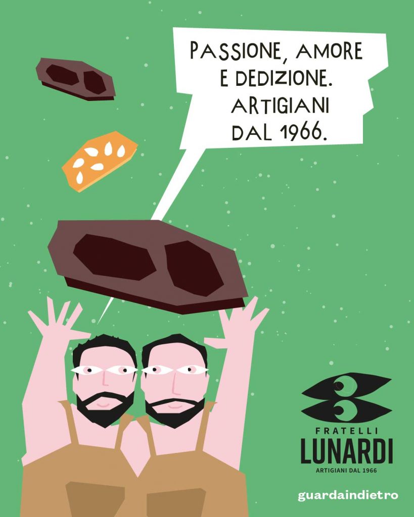
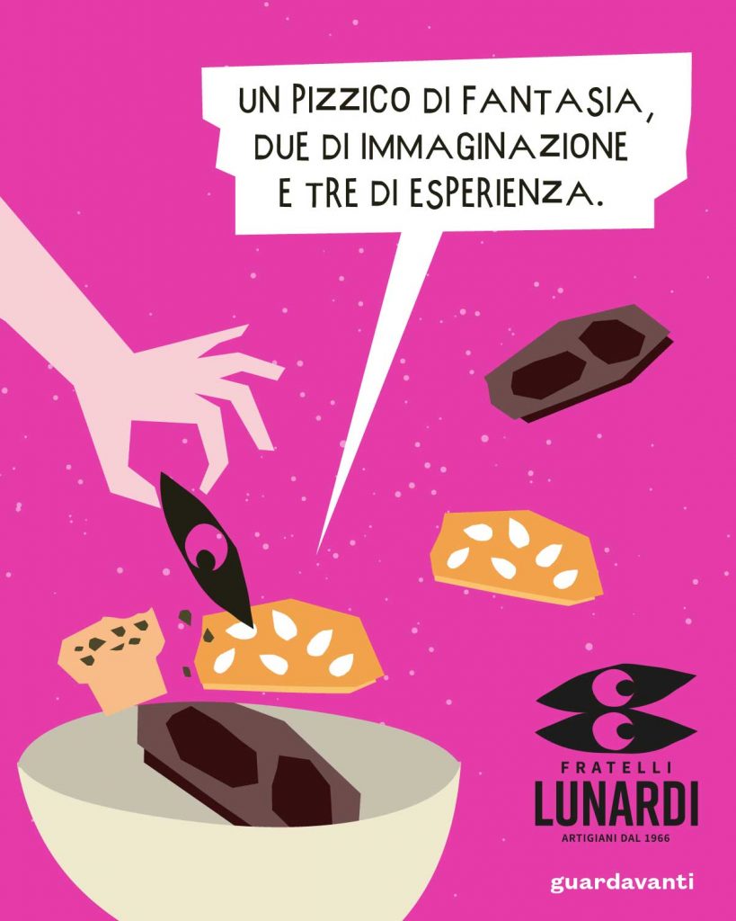
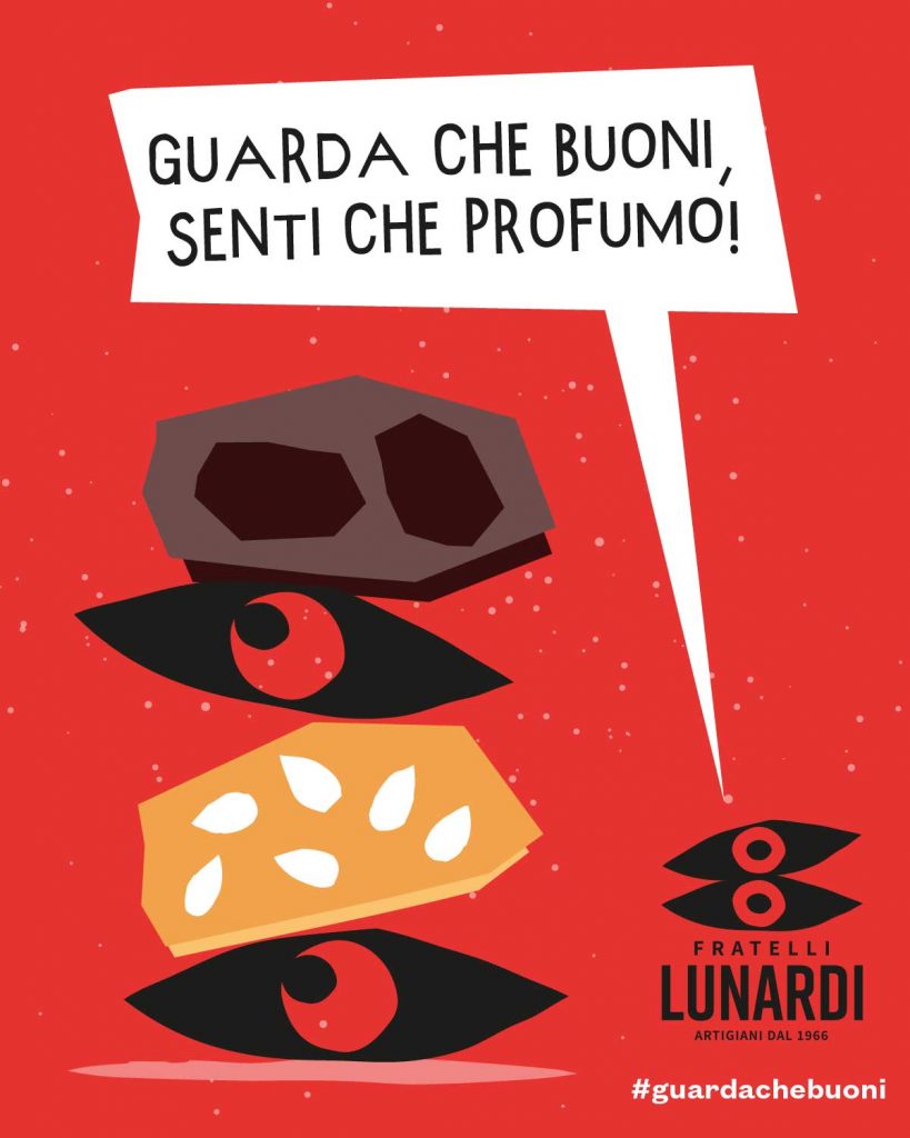
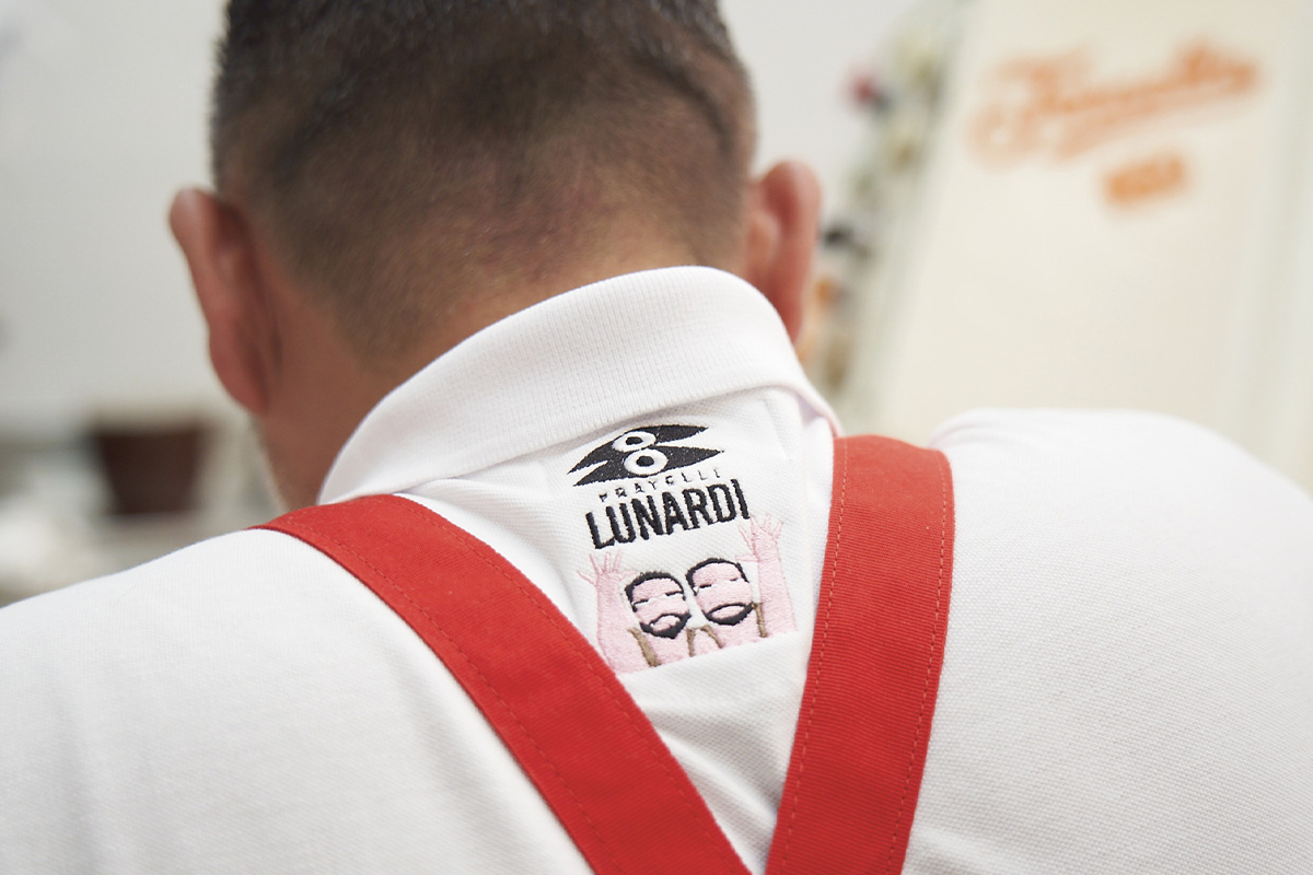
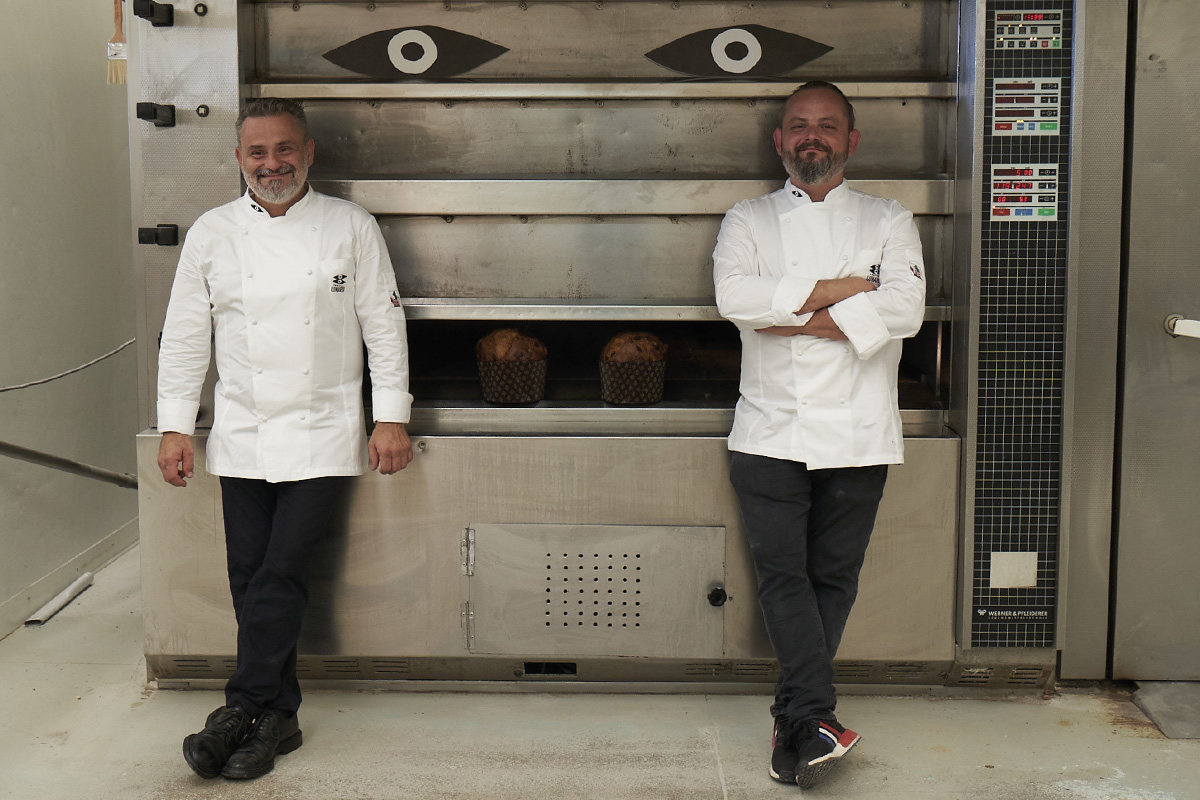
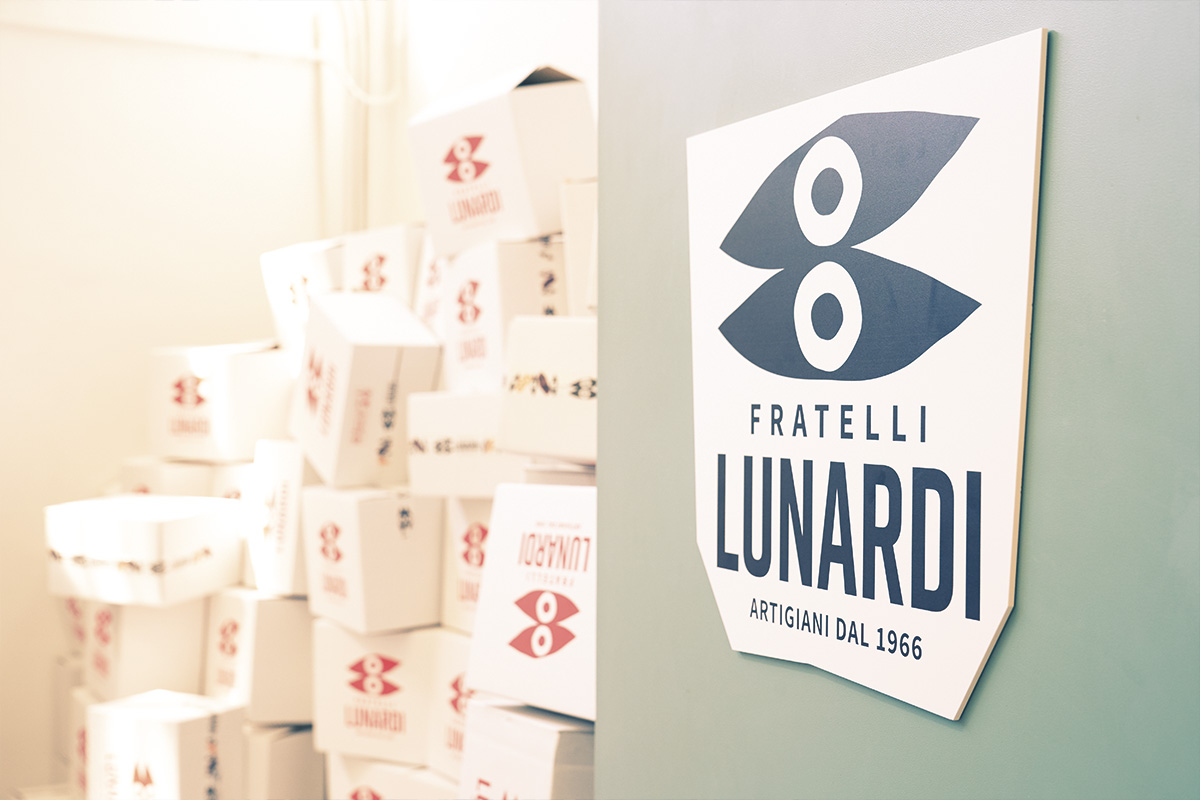
A sign, an image, a symbol. A dynamic trademark.
It is true: we speak with our eyes, too. The pupils of the new trademark move, transform and narrate. They look to the past, present and future. They look to tradition, passion and innovation. They look down to the soil and all the quality ingredients. They look up, towards the sky and all the dreams to come true. They look around, because the bond between two brothers is one of the secret ingredients.

How beautiful, the new trademark!

Three strong elements: one pictogram, one name, one payoff.
Artisans since 1966, but with a strong will to innovate and meet challenges.
Previous
Next

What a packaging!

The new Lunardi packaging cannot go unnoticed. Colours, colours, colours! Bags and boxes, big and small, for five different tastes. Each taste one colour, a special picture, a complete system of original and peculiar headlines.

What a teaser!

Have you seen? Have you heard? Have you tried? The new trademark of Fratelli Lunardi is ready to show off online, too. We decided to explain the new trademark by means of a digital teaser campaign. The protagonist is a copy strategy on the theme “eyes”. The unique, recognizable and unforgettable eyes of the Lunardi new trademark.

#guardachebuoni

Once we had revealed the trademark, we opted for presenting the new universe through a comic strip about the Lunardi true story. A digital campaign for the official launch was born: the mission and vision, along with values and products of the two brothers as main protagonists of the story.
We re-thought, re-designed and realised a tailor-made website for the company. Not only a trademark, but also an original website for Fratelli Lunardi: online shop, products, news, story of the brand. Colours, texts, illustrations and a photo shoot ad hoc to give voice to the new corporate image. What a website!
take a tour of our fadvorites