Il gusto di Xinge
Il gusto di Xinge
Space for Contemporary Feeling
branding – strategy – naming – copywriting – visual identity – packaging
A space that is more than a space. A restaurant that is more than a restaurant. A chef who is more than a chef. Florence lights up with the taste of Xinge and almagreal shines with pride.
Courage. Love. Tenacity. These are the first three words with which Xin Ge Liu and Lapo Bandinelli described their project, a large new restaurant that would be the natural extension and contemporary evolution of Il Gusto Dim Sum, their first space opened in Florence. Three words whose semantic fields we explored, dismantled and reassembled to reveal a new horizon, brought closer and further apart to shift perspective and create a new outlook, as we always do at almagreal. From there, we began to create a new identity supported by a strong, clear, and evocative strategy: the identity of Il gusto di Xinge.
Courage, to take a risk and defy habit.
Tenacity, to pursue a vision and give it shape.
Love, to create desire and build beauty.
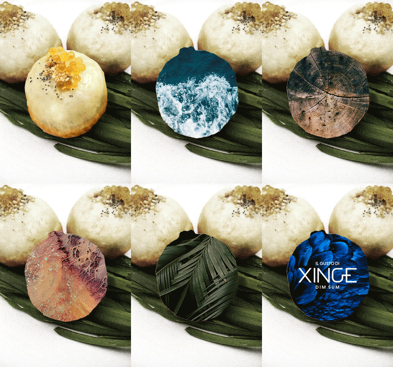
When a name becomes a brand.
Since the beginning, we haven’t had any doubt. A new space, a new path, a new name. Furthermore, a new brand, which distances itself from the generic and already familiar connotation of Il gusto Dim Sum. With equal certainty, we chose to give Xin Ge a leading role, starting with the restaurant’s name. It is her inspiration that leads to the creation of dishes, visual journeys, fruit of constant research that feeds on poetic and polished suggestions before becoming creations where the taste is not only that of the perfect balance of flavors but also that of an aesthetic, almost artistic one. Il gusto di Xinge, The taste of Xinge, indeed.
Xinge’s X-Factor
The first step in building the new branding was to create a new trademark, on which to build a brandvironment that restored the refinement, contemporaneity and vision of Xin Ge and Lapo. A clean and incisive brand, where rough and essential lines are softened by the roundness of the G sign, inspired by the passage portal present in the room. The infinity of the circle and the rigor of the lines, to summarize an ideally endless path, guided and supported by iron will and a strong personality.

The taste of Xinge? But, who is Xinge?
Ethereal and sweet human being, decisive and pungent.
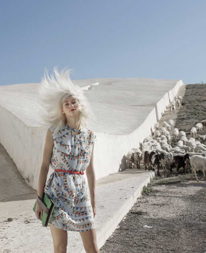
Xinge has the world to come in her eyes and the delicacy of colors and shapes in her heart. She knows how to see. She knows how to hear. She knows how to create. Force and fire. The acuity of vision and the extravagance of flavors.
Xinge is alternative, rebellious, icon.
For each dish Xinge creates a moodboard that talks about art, fashion, emotion. Explosions of colors and shapes which then find life in the balance of aromas and flavours, between aesthetic and taste balance. Xinge is the heart. Xinge is the cornerstone. Xinge is the center. And around her we have built a universe.
Main character and main stage.
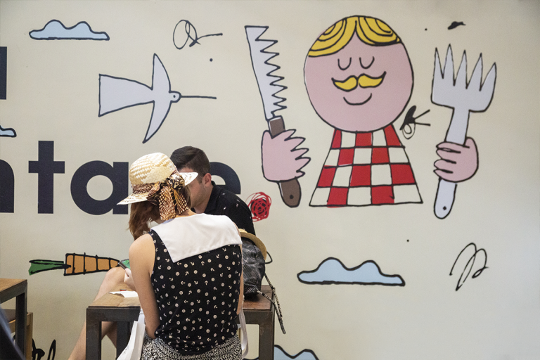
The taste of Xinge lights up the avenues of Florence. The architecture studio b-arch has created a sort of bright aquarium, creating a recognizable and strong point in an area just outside the historic center. The signs that recall oriental culture are elegant and minimal, the details that make room for contemporaneity are strong and assertive. In the venue, the passages from one room to another are ideal portals with soft shapes, recalling the ancient Chinese doors and the infinite meanings enclosed in the circle. Talking about colours, the nuances of warm brick red –a contemporary and elegant derivation of the red of Chinese lacquers – contrast with a bright blue china, giving small touches. Refined and elegant essentiality.
The art of the menu.
Could we limit ourselves to classic paper? It’s not in our DNA! For the menu, we studied a modular support that takes us back to the world of art and vernissages, creating a visual dynamism that reflects the dynamism and constant evolution of Xin Ge and Lapo. Macros of photos with blue ink interventions evocate a story and leave room for suggestion, small compositions that introduce each dish are instead intended to be an ideal taste of the internal journey that led the chef to the creation of the single course. Different supports for different times of the day.
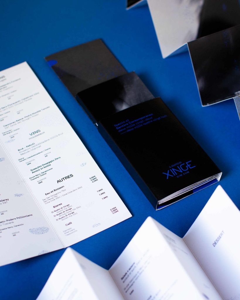
A universe, a voice.
As usual, when we build a brand, we leave nothing to chance. Stationary, coordinated image, business cards, internal supports of the venue and everything that speaks of The taste of Xinge must be linked by a common thread. Indeed, in this case, a touch of blue. Nothing is left to chance, everything has the tone of voice that we designed and modulated for Xin Ge and Lapo. We like to think that even the smallest of supports can become an opportunity to get the brand talk. Even when it comes to a small box that becomes a treasure chest in which to place a dessert, a gift from those who have experienced the cuisine of The Taste of Xinge.
Beside cocktails, beyond drinks.
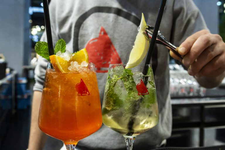
Right because everything has to speak, modulate and sing the same melody, the creation of a naming and a branding of the cocktail bar inside the venue seemed a natural choice to us. A second level logotype was born giving life to Drinx, starting from the matrix of the new brand.The initial D is generated by Xinge’s G and the X closes the name giving a twist of sound and visual differentiation, connecting directly and unequivocally to the original brand. Simple? Yes, we say it with pride. With equal pride we say that it is effective, musical, clear. And that –which is fundamental for us – works!
Architect B.Arch
portrait photo credit Le Officine
interior photo credit Mike Tamasco
Curious?
Discover all almagreal’s projects.
You won’t regret it!

