Skip to content

OOO / Out Of the Ordinary communication

OOO.

Out Of Ordinary.

strategy – branding – creative direction – copy strategy – ADS campaign & media plan – setting up – label&merchandising – menu design – digital content

This is not a food space. This is a concept.
This is a meaning, sense and taste. This is OOO.

A place where being is staying and staying is being. The out of the ordinary place in Florence, where living local meets a global discovery. We handled naming, branding, visual identity, set-up, launch and support campaign of this extraordinary project.
Let’s mOOOve!

New cOOOncept.

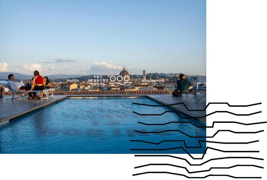
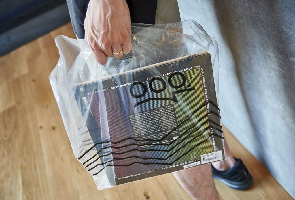
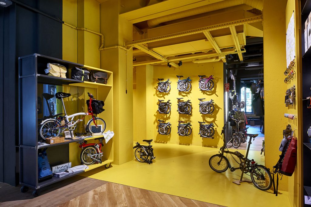
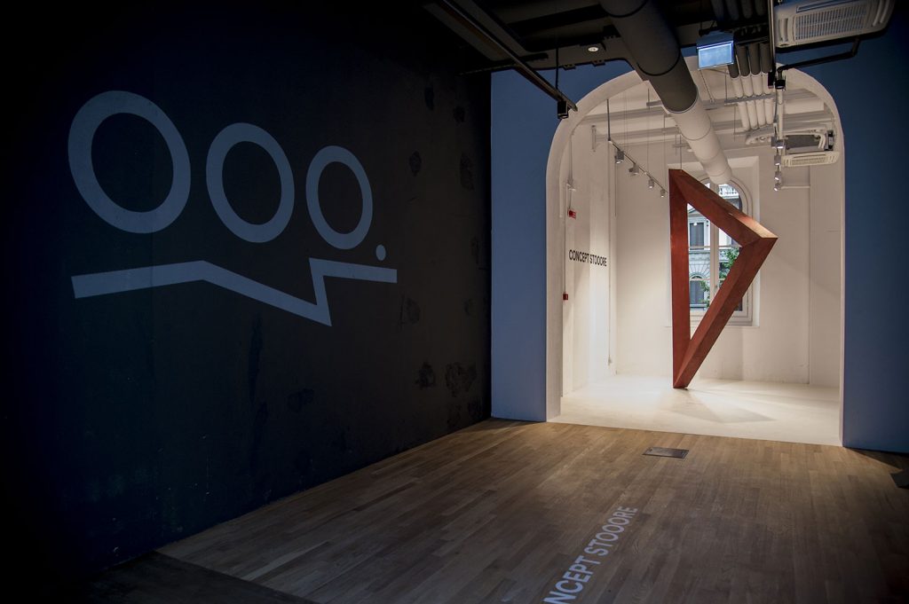
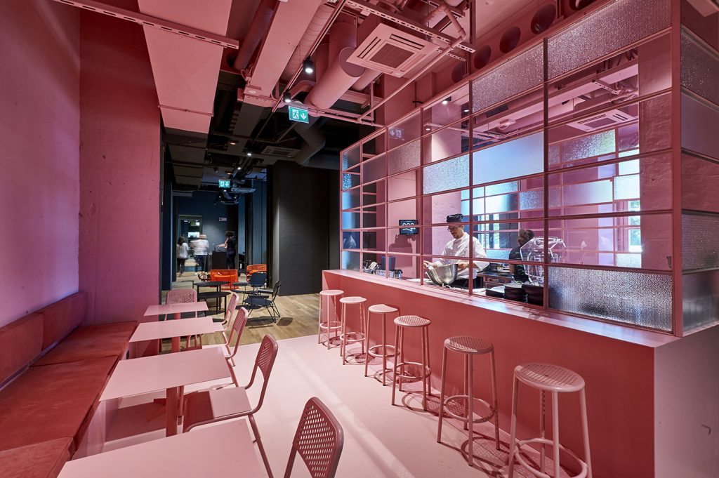
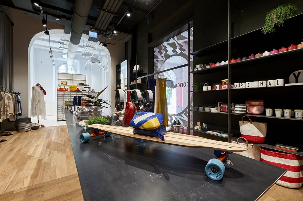
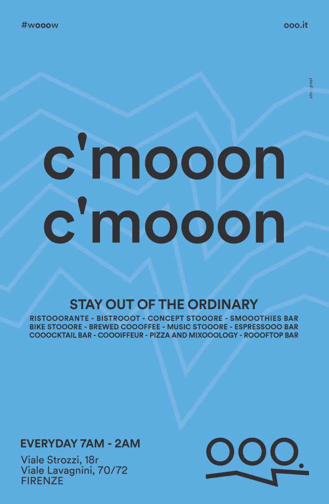
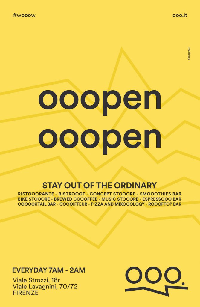
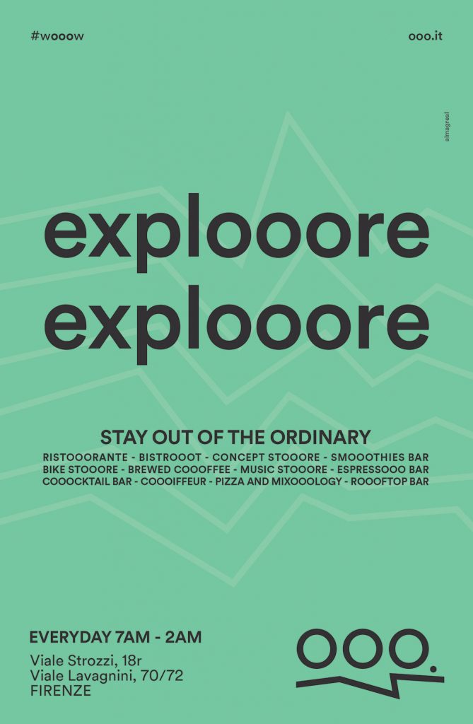
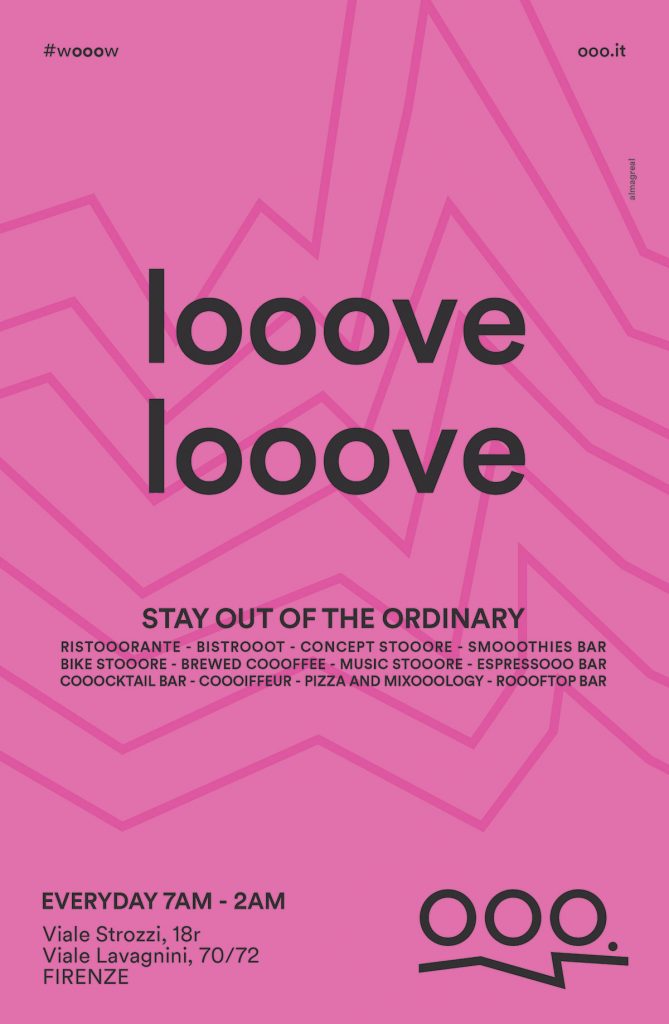
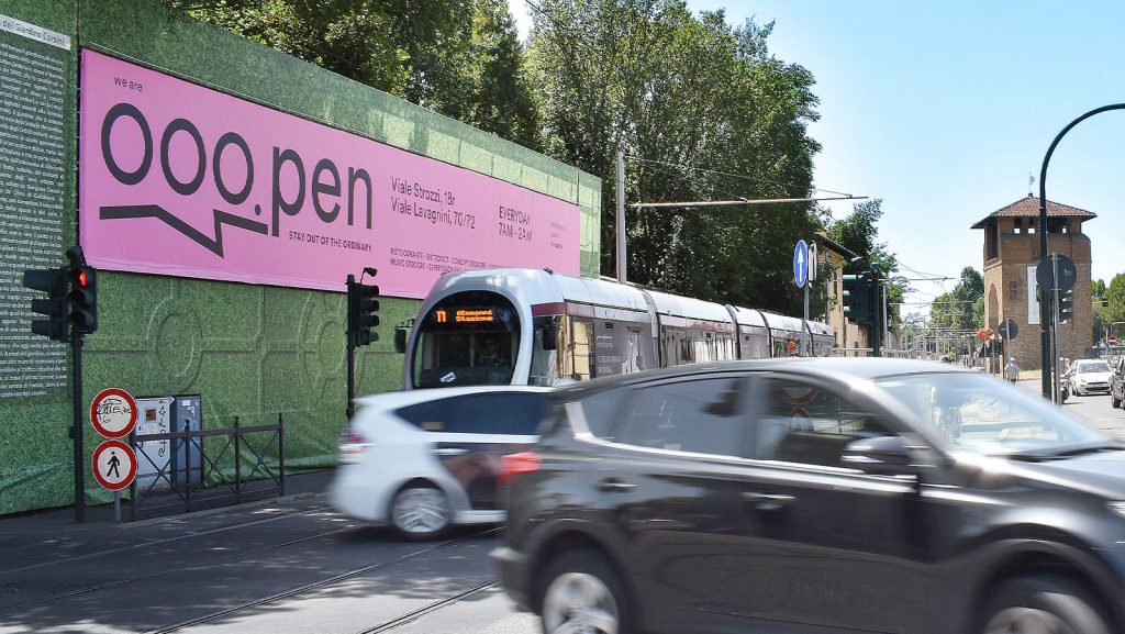
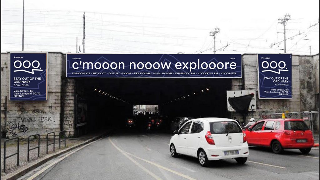
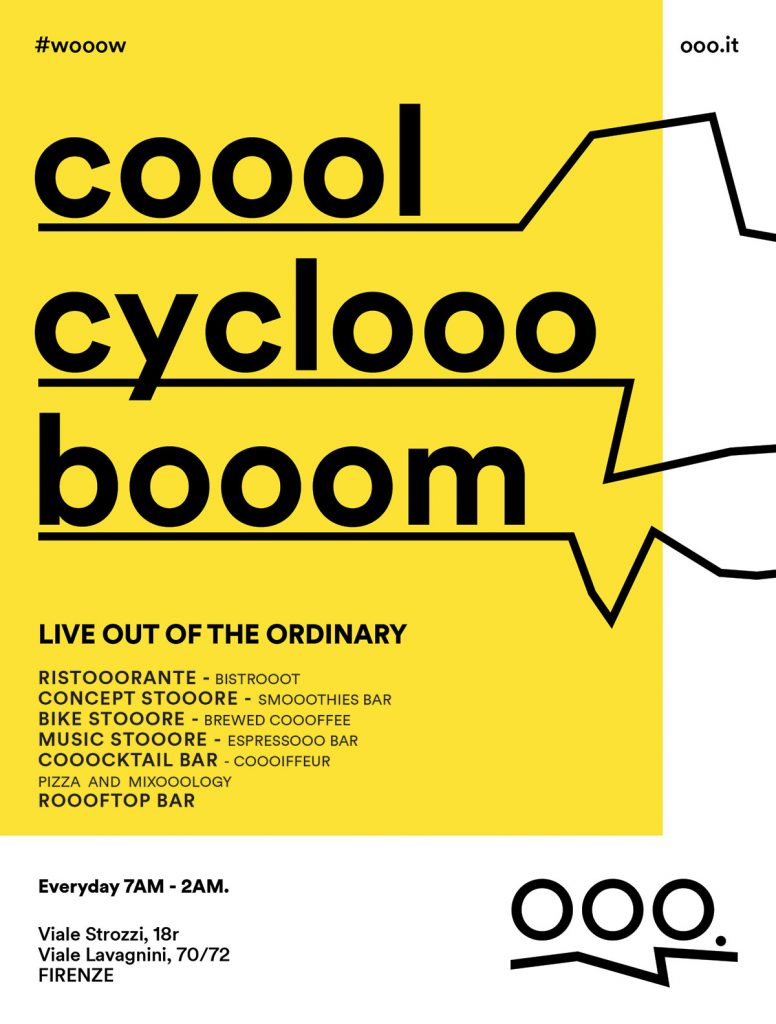
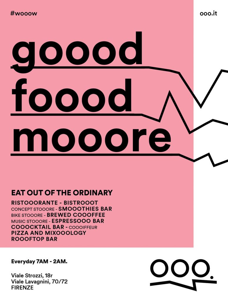
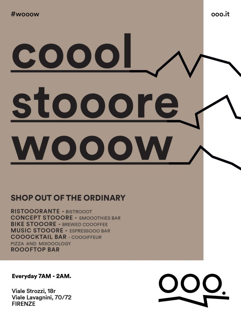
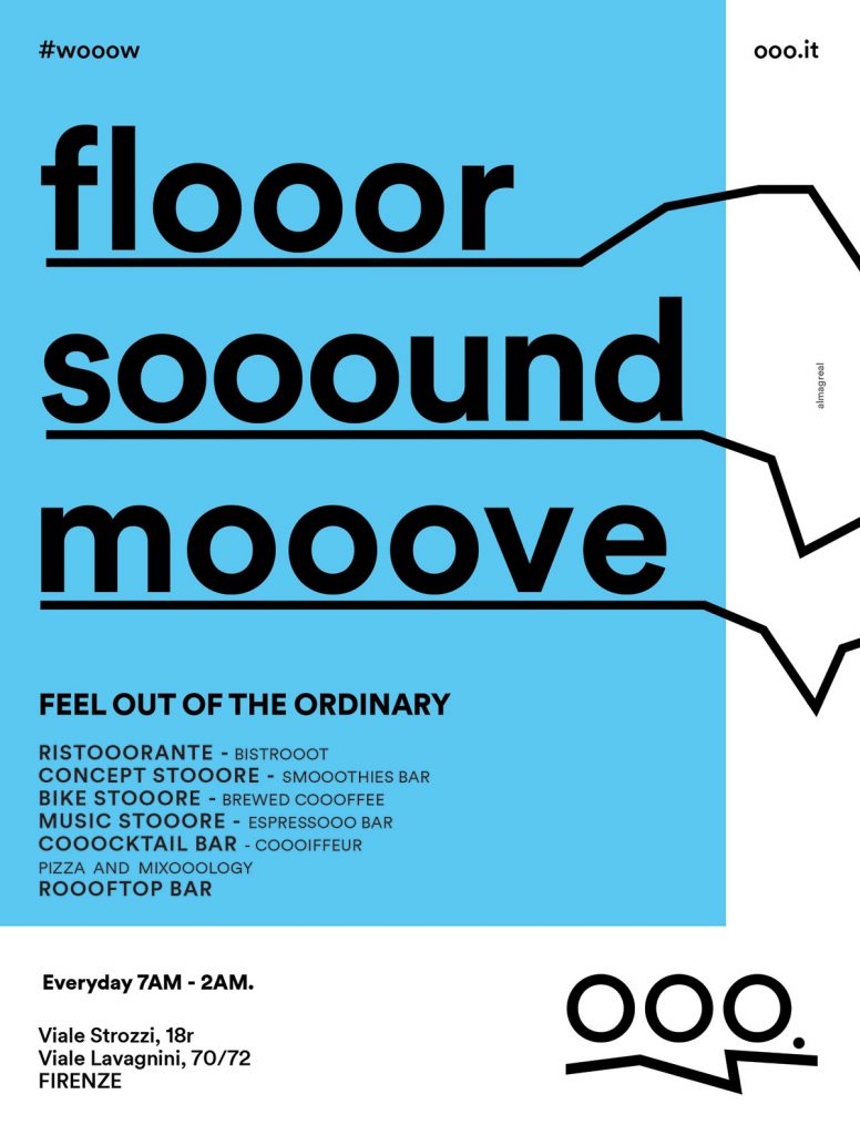
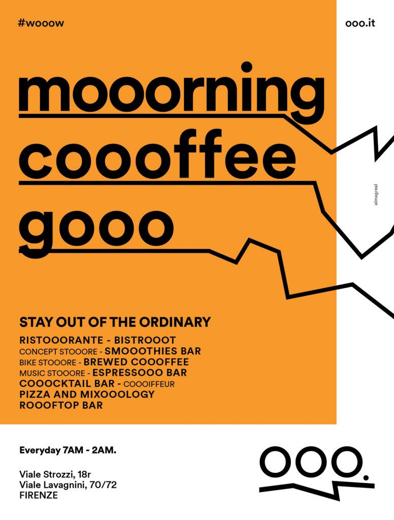
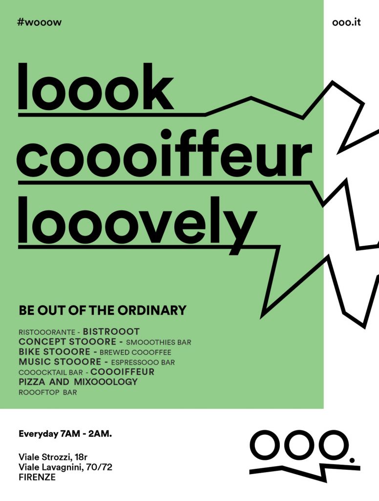
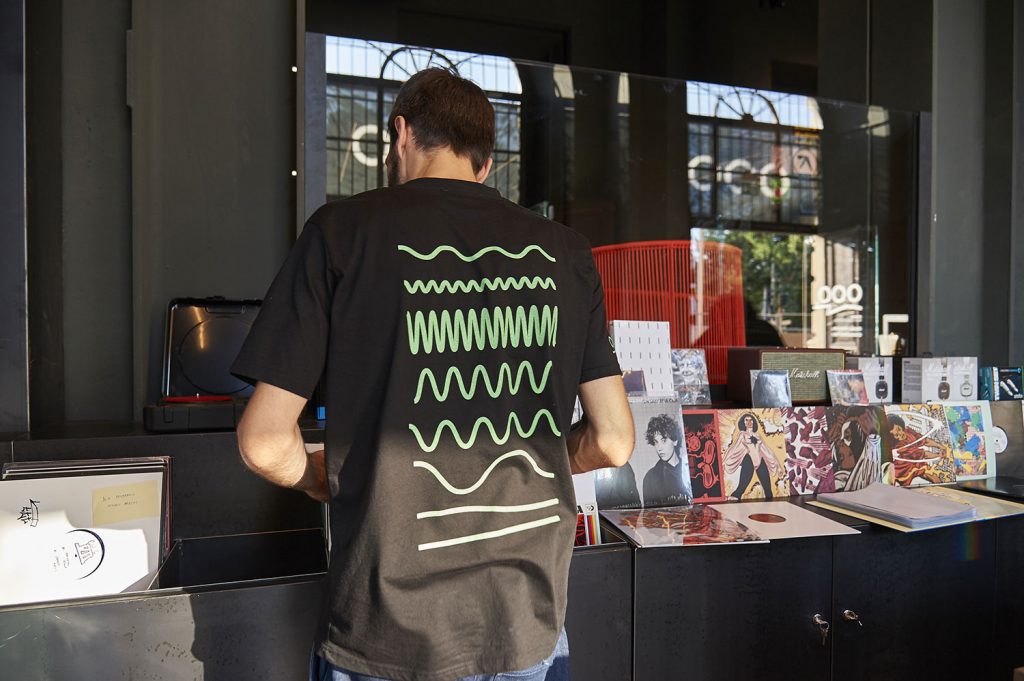
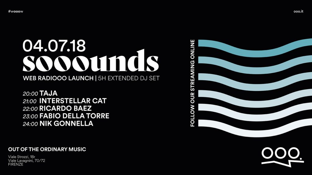
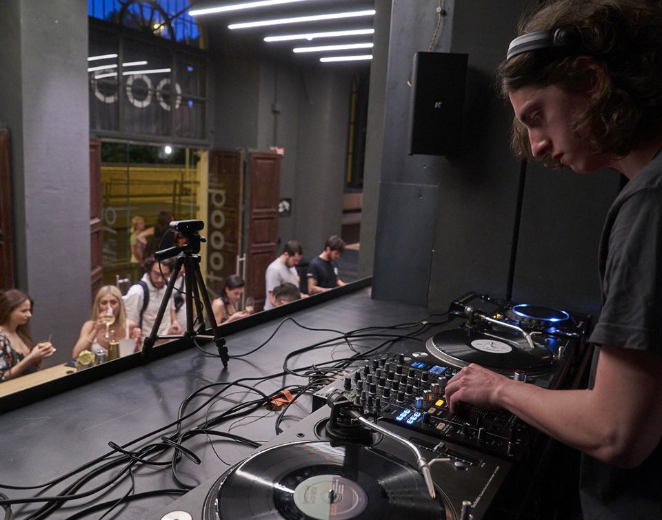
We found a cOOOntainer of many realities. Concept store, music store, bistro, restaurant, coffee bar, bike store, coiffeur, bakery. A centre of stories, experiences and visions from the world. A place where unicity is at its peak among designers, artisans, extraordinary artists. Extraordinary is past, out of the ordinary lures. It writes. It shakes. It sets the rhythm.

OOO.

Out of the box. Out Of Ordinary, sure. It belongs to now, absolutely. However, it strives to go beyond. OOO is ground-breaking with respect to what there was and is to find now. It is something to talk about and that people will talk about afterwards

New lOOOgo.

A sound, OOO. Wonder, absolute harmony, purity, musicality. It is voice made sound shaking imagination and perception. An earthquake turning into waves and adapting to the many realities that is made of and contains.

Let’s mOOOve.

A name is just a name without an own identity and character. It needs more than a logo, but a graphic and narrative home. The brand evolves becoming a whole system where elements connects to the outer world. INSPIRATIOOON
I follow the rhythm
MOTIVATIOOON
I beat the rhythm
DEDICATIOOON
I shape my time
MUSIC STOOORE
BISTROOOT
RISTOOORANTE
COOOFFEE BAR
CYCLOOO
CONCEPT STOOORE
COOOIFFEUR
FOOORNO
Previous
Next

LOOOcation.

Not only a place, but also a place that is house to many places.
OOO is amazement. Exploration. Atmosphere. Discovery.
A flowing space with many facets. Products and stories position themselves in the space, living and creating different places. The strong identity of the set-up holds every corner together turning each area in the essential part of a whole body.

#itscOOOming

It’s coming. It’s opening. It’s going to astonish. The media campaign is designed in progressive phases, obviously planned and scheduled to narrate events from the opening to the launch and support. The first stage is a billposting teaser campaign all around the city of Florence. It strikes the eye, makes people curious and makes them talk. It’s coming, but doesn’t state what and how. It tells when: save the date, it’s cOOOming!

Not OOOrdinary advertising.

An out of the ordinary place has to behave in such a way.
You cannot – and must not – talk about anything else. It’s coming, it’s everywhere.
Especially on the streets, among people. This is how a creative and artsy operation of guerrilla marketing was born. Respecting public spaces and environment, creating high-impact, underground, absolutely out-of-the-ordinary situations.

wOOOw, cOOOl, gOOOd

Are you curious? It’s time to unveil the name of the new concept store on everyone’s lips. The second stage of the campaign – that mirrors and integrates the first one – is wOOOw, cOOOl and very very gOOOd.

multiplatfOOOrm

Billposting, dynamic ADS, press, digital campaign. An accurately planned campaign, therefore a successful one.
OOOne more time?

And mOOOre.

We realized a brand that allows us the use of a powerful and coherent system in both the internal and external communication, by shifting the focus on the different spaces and services of the store.

We are lOOOver.

Six menus, postcards, instore holders, business cards, institutional, advertising and event communication materials. We designed a visual identity that adapts to different supports – printed and digital – that interact with each other by means of shapes and colours.
Play Video
take a tour of our fadvorites