Skip to content

Floressence

Floressence

It's a gin, not a sin.

branding – strategy – copywriting&storytelling – visual identity – illustration – packaging – labeldesign – webdesign – social content

Once upon a time, there was the wife of the King of France. There was once. Because today the queen is someone else.

She is the queen of Floressence, the dry gin born in Florence and inspired by Catherine De’ Medici’s perfume. A new player in the world of spirits, with a sophisticated, out-of-the-ordinary and rebellious reputation. From the brand concept to the design of the entire visual identity, from the creation of the label to the conception of all the online and offline communication tools. The concept we created for Floressence is a unique system of graphic, chromatic and verbal elements. 

Refinement distilled with eccentricity.

Let’s have a gin.

The elegance of verticality, the premiumness of shapes and the extravagance of kerning. The Floressence brand has been designed to convey the full brand essence of the Tuscan spirit. A captivating and original logotype, accompanied by a sophisticated and refined pictogram. A pomander that becomes the signature and seal of Floressence, the distinctive and narrative element of the brand.

Queen save the gin!

Refined, yet indomitable, complex and nuanced. The queen we created for Floressence resembles her favourite thing: her gin.
A modern craft trait, a vibrant premium flavour and an anti-conformist attitude.
A visual identity that is not afraid to position itself among the excellences in the world of spirits. The queen of Floressence is naked, because she wants to be!

dedicato a

A story sealed in a bottle.

It’s safe to say we like the Floressence bottle both full and empty (better full, though). Designed with regal details, a premium attitude and gold decoration. The main colour of the label is blue, the queen’s favourite colour. On the cap is a pomander, like a seal. Inside? A story to be discovered and sipped.

The path to the kingdom is paved with empty glasses.

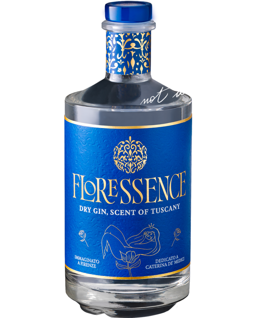
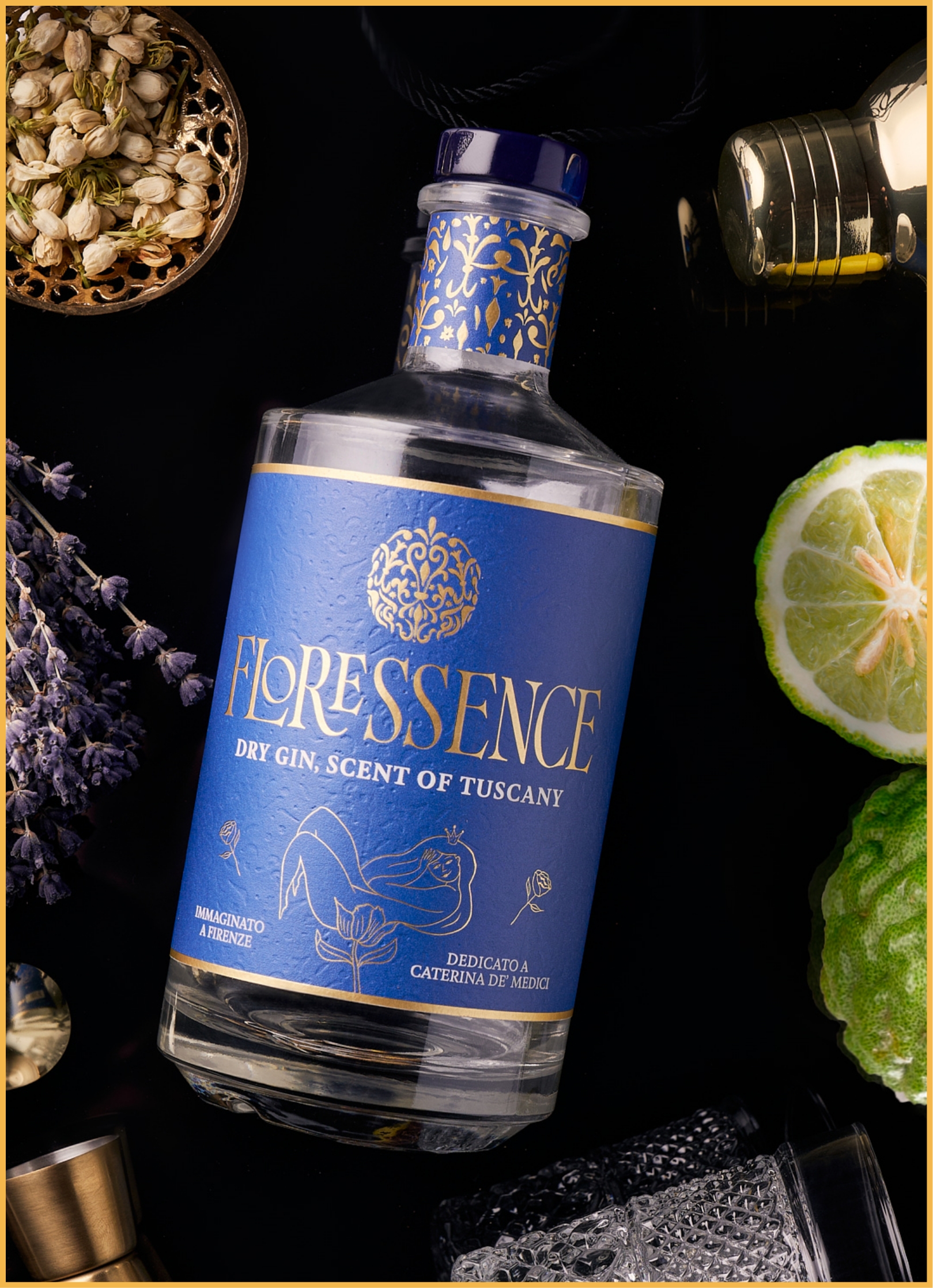
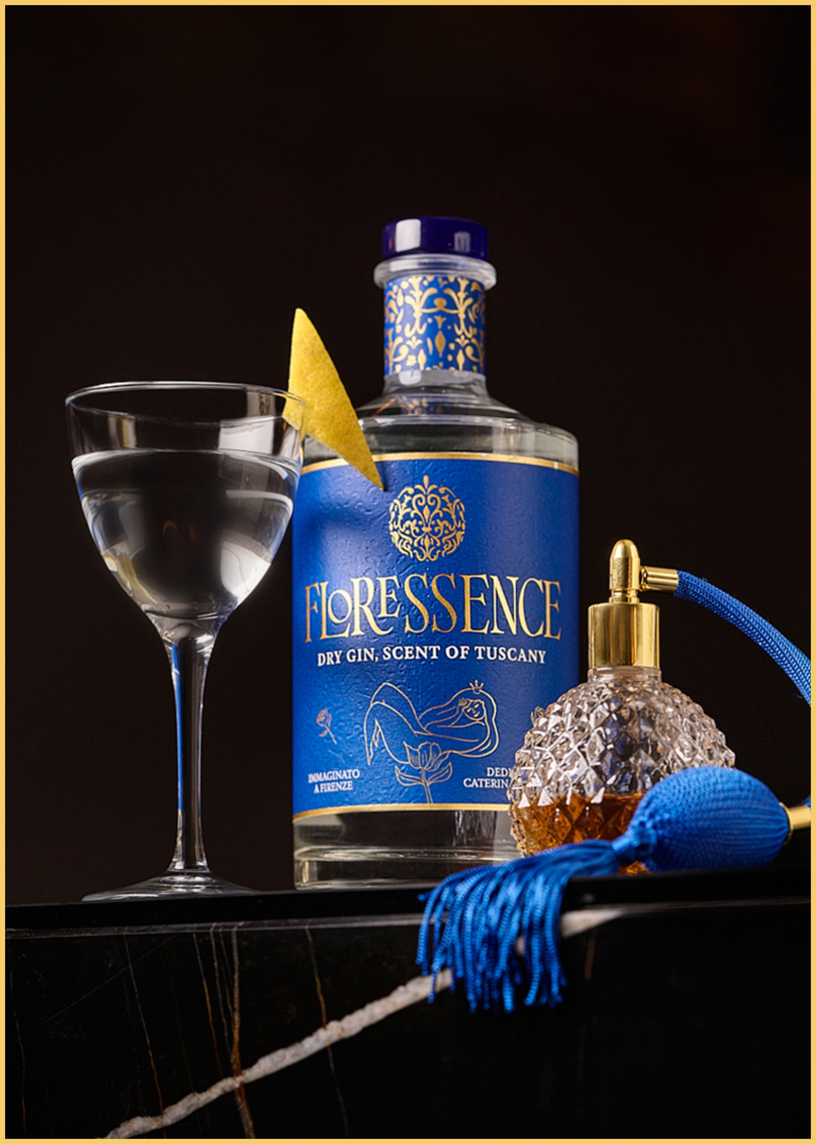
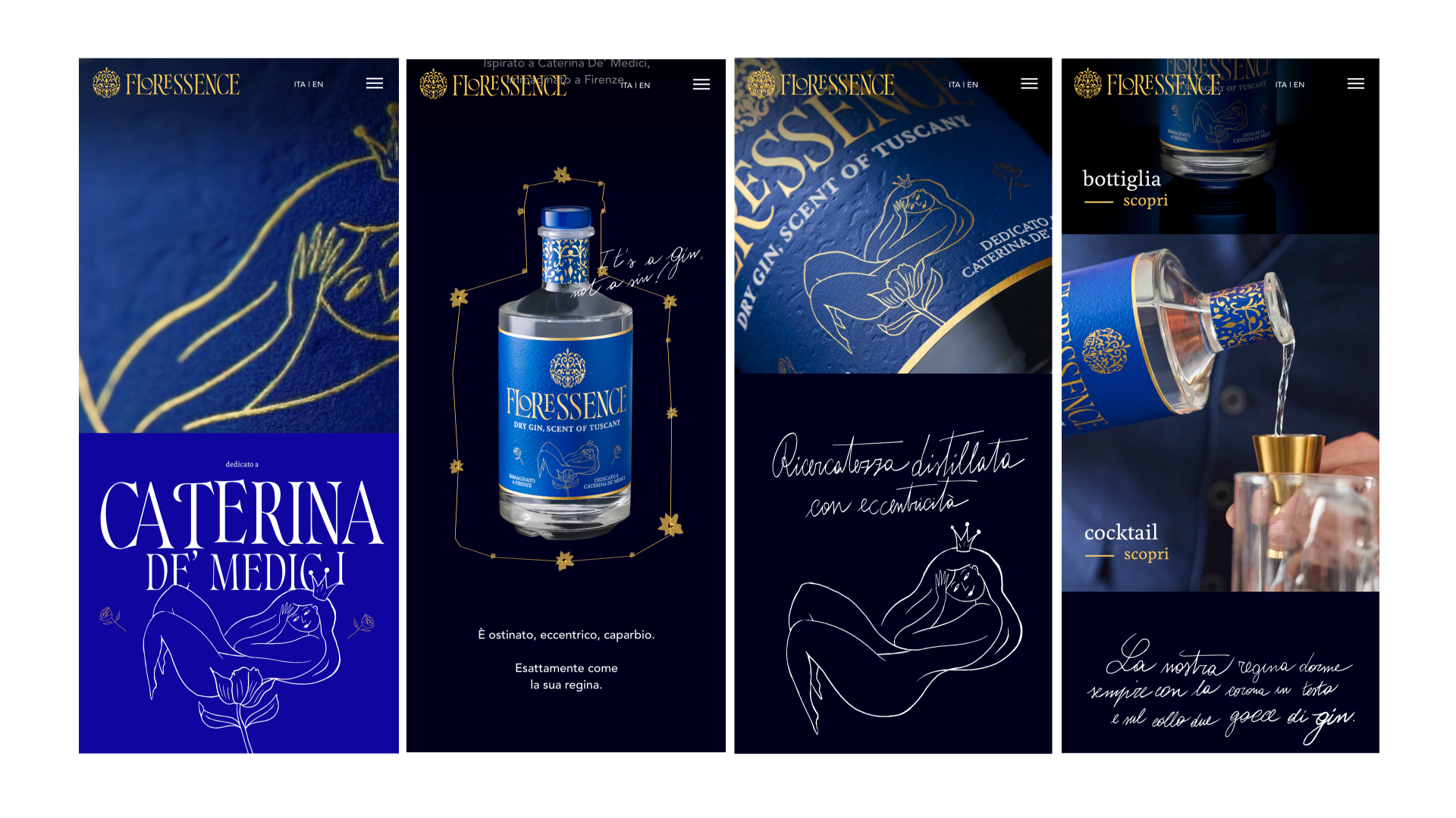
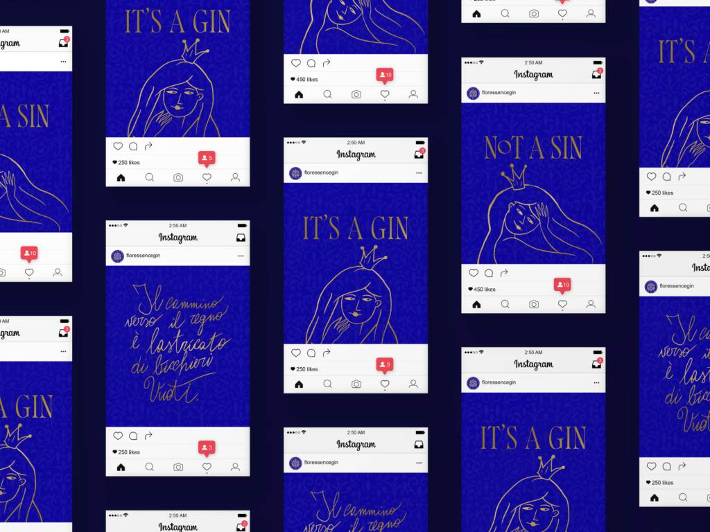
A character with a unique personality, an irreverent appearance and a stubborn tone of voice. The queen of Floressence never goes unnoticed. The star of the label, website and social channels – our queen – is anything but the King’s wife. Sharp, funny, iconic. She writes all her thoughts by hand: on the bottle, on the website, on every piece of paper she can find. Signature statements that identify her lifestyle and writing. A regal copy strategy.

Online and on the rocks.

If you are of age, we suggest you go to floressencegin.com and enjoy the website we designed for the new Florentine dry gin. We put in web design, user experience, copy strategy and three ice cubes.

We love gin. Do you share?

The brand presentation took place at Taste 15, the international taste fair hosted by Pitti Immagine in Florence. The social launch of Floressence was accompanied by a teaser campaign with irreverently blue tones. A launch headline that intrigues, sounds and is easy to share. It’s a gin, not a sin. Do you wanna Taste it?

The blue feed we like best.

product, storytelling and lots of gin. A feed with a strong personality, where product photos are enhanced with inspirational graphics and copy.

photo credits: Martino Dini

take a tour of our fadvorites