Skip to content

Mercato Centrale Roma

Il Mercato Centrale

Mercato Centrale Roma

strategy – branding – visual identity – creative direction – setting up – graphic design – menu design – ADS & media plan – web design – digital content

In October 2016, Mercato Centrale gave an encore and opened in Rome, Via Giolitti 36.

As well as for Mercato in Florence, we followed the whole communication project here, too. The system we created so far moves around a precise concept: tastiness is simple. We are living through a moment in history when we are bombarded – especially for what food is concerned – by pictures that are far from reality and a universe of meaningless words, therefore, the choice for Mercato Centrale Roma aims to essentiality in signs and contents.

The rediscovered space.

With the opening in Rome, Mercato Centrale gives back to the city an important place and an ideal meeting point of taste. The Cappa Mazzoniana of the former Railway Recreational Association (DLF) comes to new life and Termini becomes far more than a place of transition, but a point of arrival for those who look for tastiness. Cappa is still the core of the space and it is immersed in the new language planned and created for Mercato Centrale Roma. Site-specific interventions, walls that talks about a new way of narrating food, three colours only to go back to an essential expression made of everyday feelings to enjoy with the eyes.

A new language.

Tired of the ways of presenting and representing food we are used to, we opted for a kind of communication that could pay homage to the innovative soul underlying the concept itself of the project Mercato Centrale. Fed up of all the bad copies of drawings, handwritten font, creative language, meaningless words used in relation to food, we decided to press down on the throttle and make a leap forward. We took the liberty of wiping off. In order to be remembered and return to the origins.

The doodle meets the circle.

A handwritten trait, a doodle that sums to the circle of Florence becoming logo and even a new alphabet. It gives birth to a clear and essential spelling book, for a communication that strives towards reducing the background noise and crowding that characterises the world of food, lately. Tastiness is simple. Rather, elementary.

The affirming erasure.

Erasing does not simply deny something, rather states new meanings: it turns a negative sign into a positive gesture. The doodle originates from an erasure mark that becomes sign. The erasure insinuates in writing and modifies it. It never denies, but rather highlights. An ever-changing doodle, unrepeatable in its uniqueness. A distinctive trait.

Custom font, unique and recognisable.

For Mercato Centrale of Rome we designed a doodle font, because we chose to start from the basics of an alphabet and get straight to the new language of food. A way to re-learn how to read and write the truly and simple essence of food.

Artisans of Mercato at the centre.

Artisans are protagonists here, like in all other Markets. Therefore, they become hand-drawn characters characterised by simple and effective traits, silhouettes showing off their own character and personality.

A new way of talking about food.

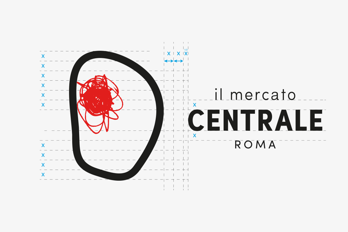
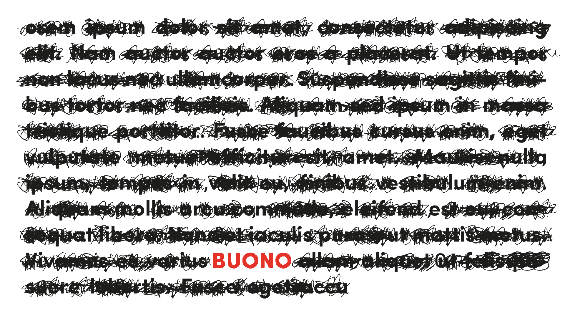
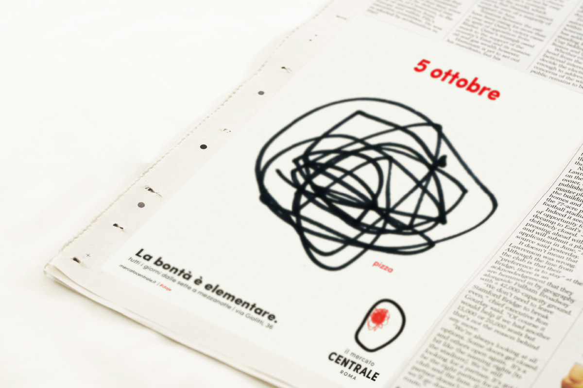
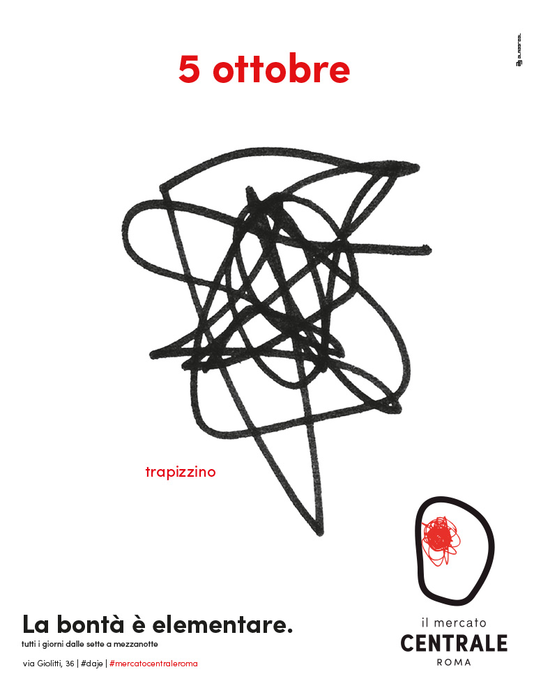
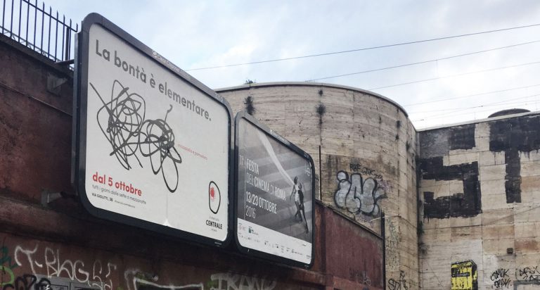
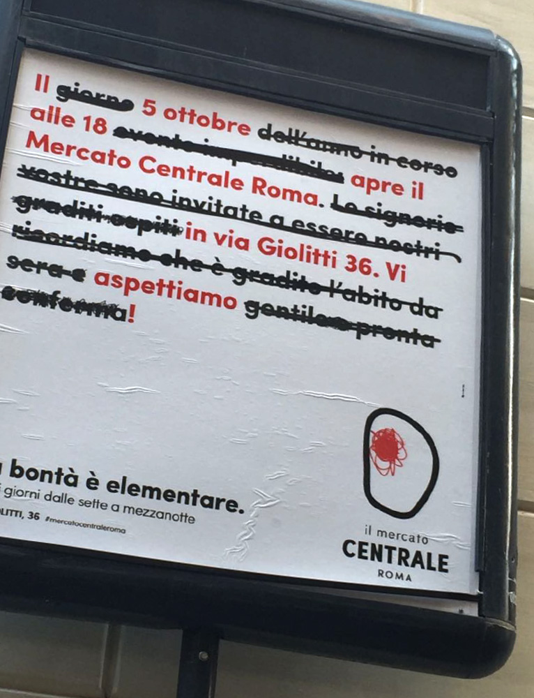
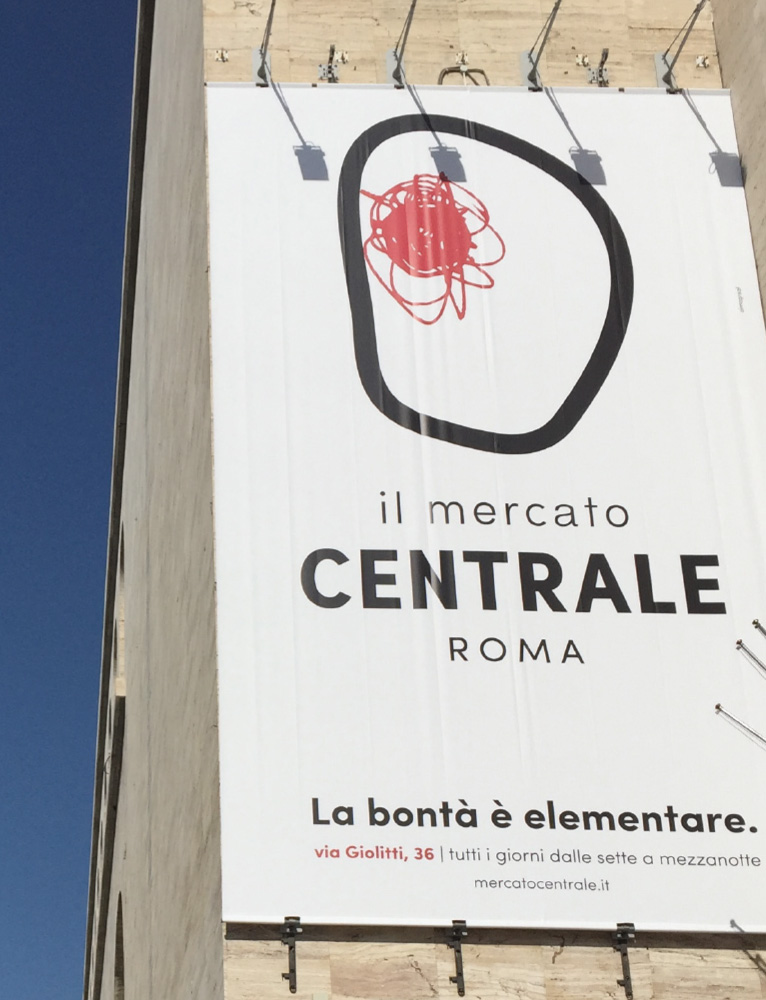
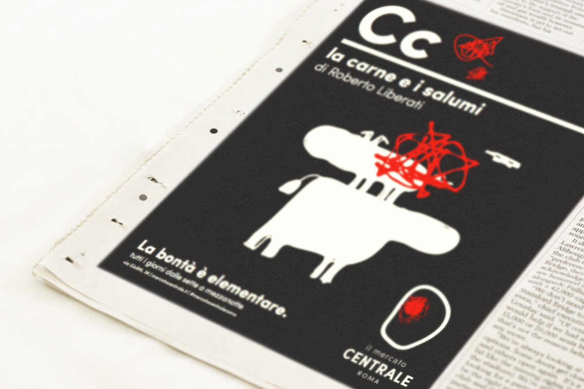
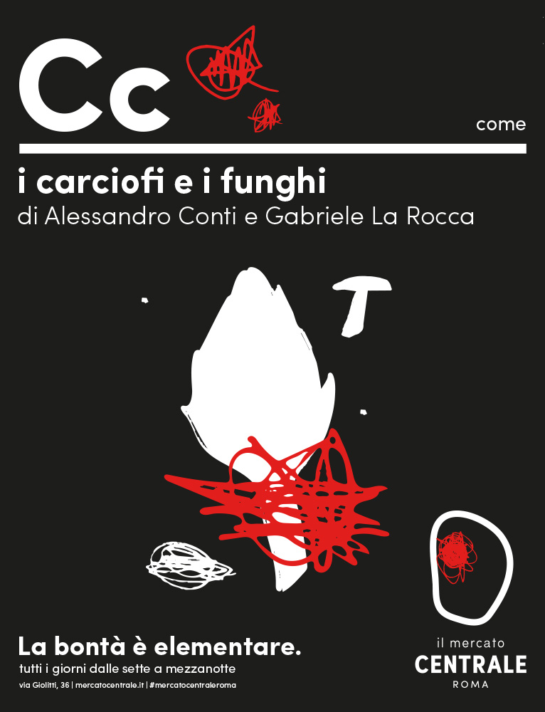
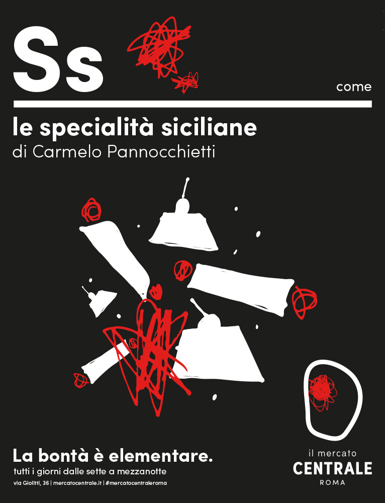
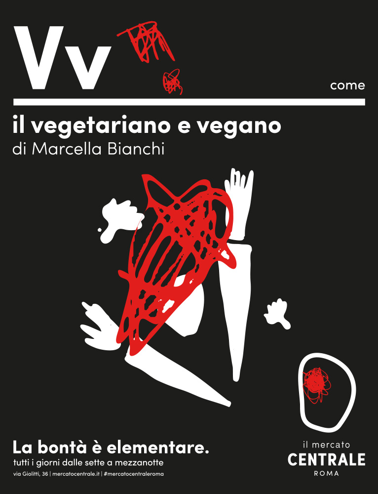
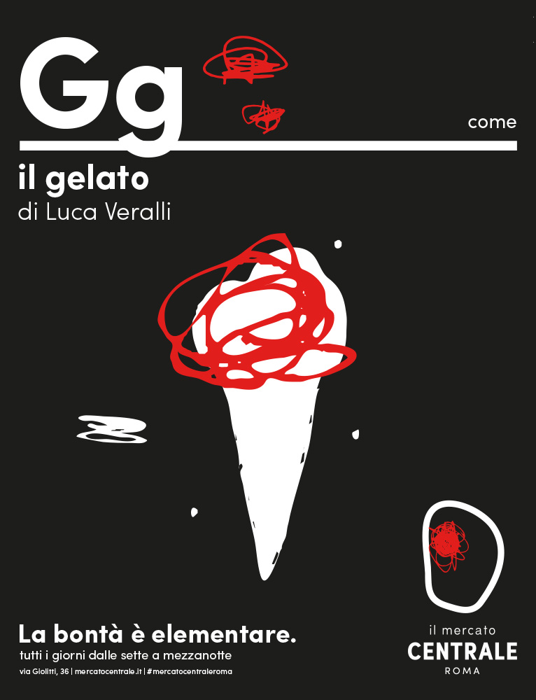
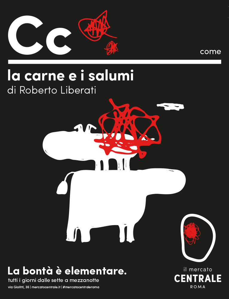
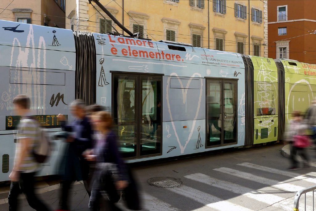
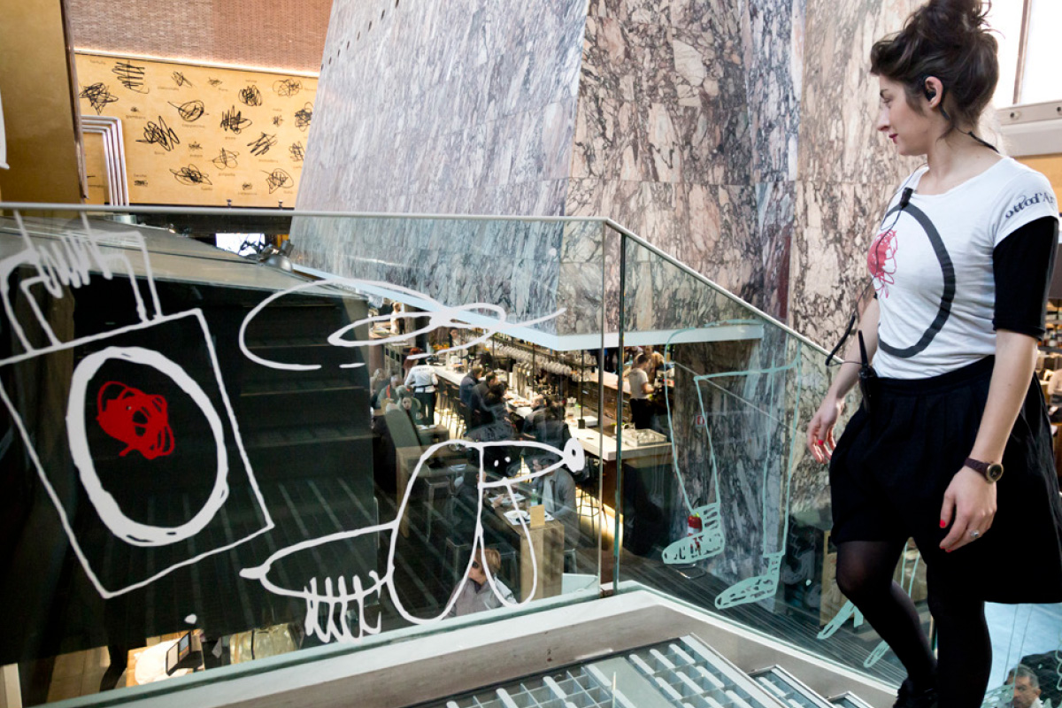
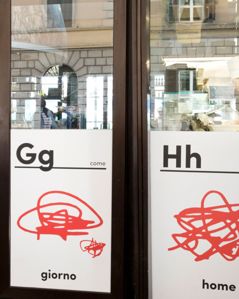
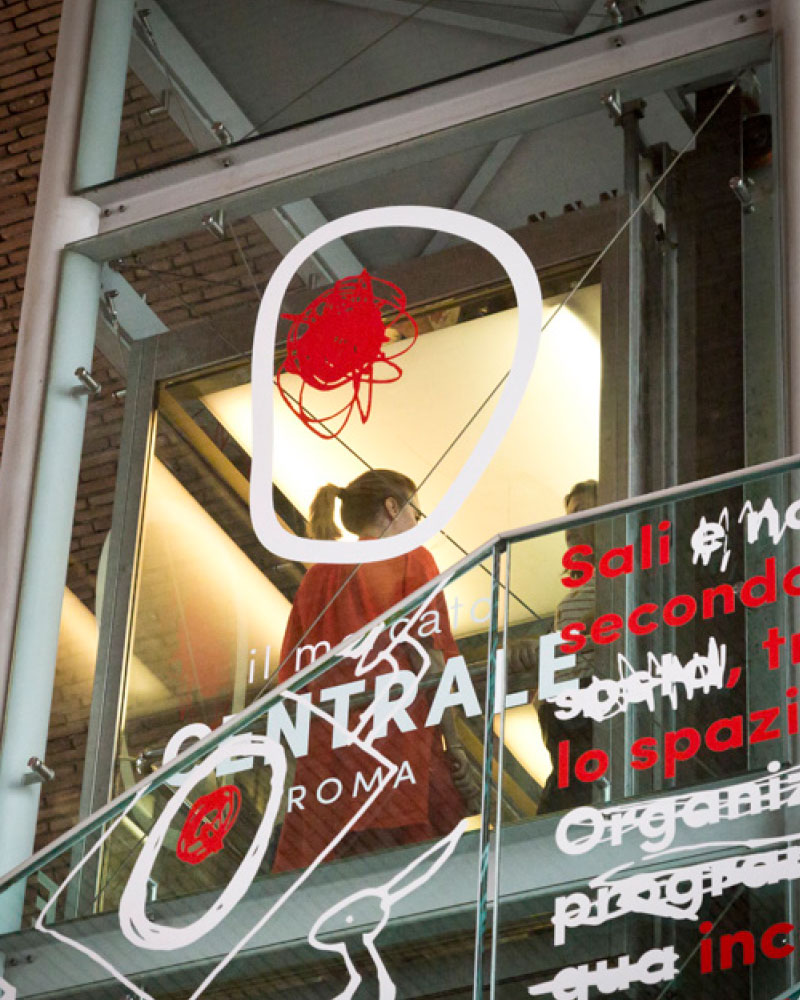
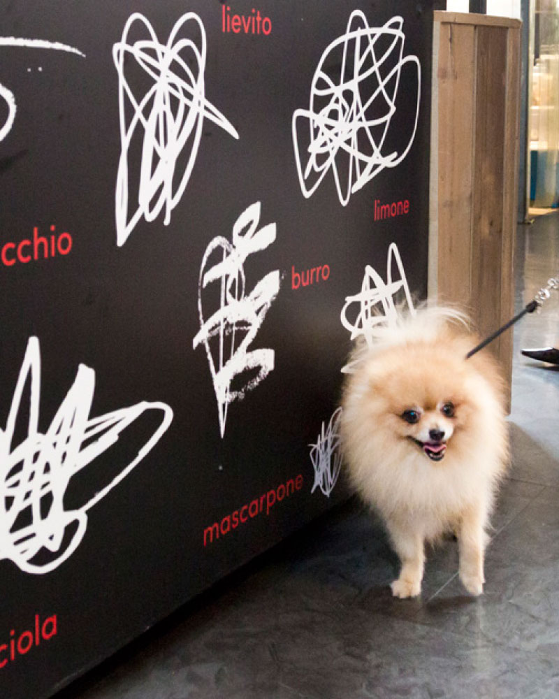
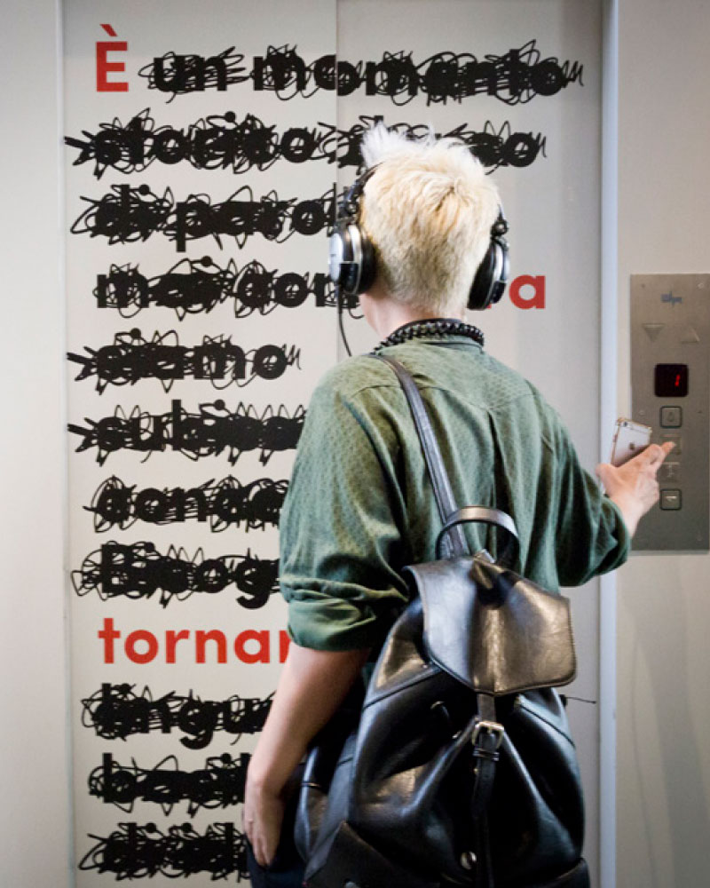
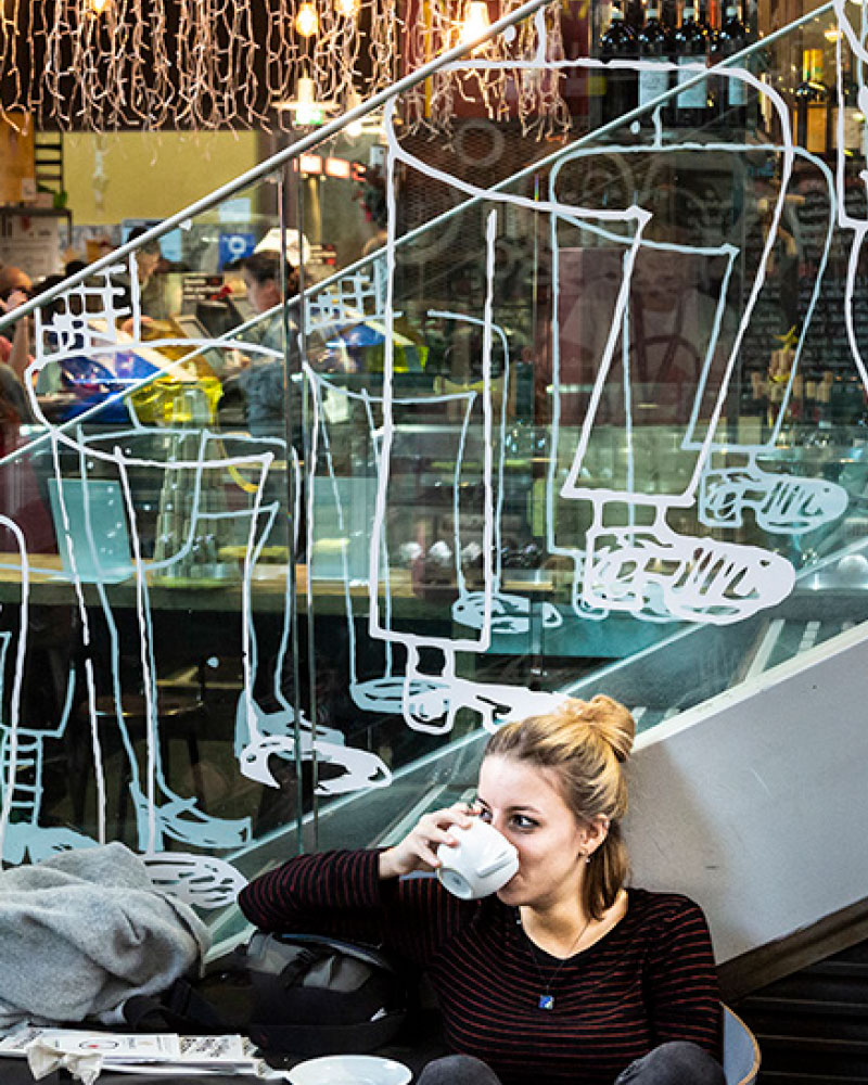
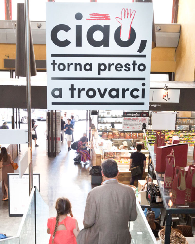
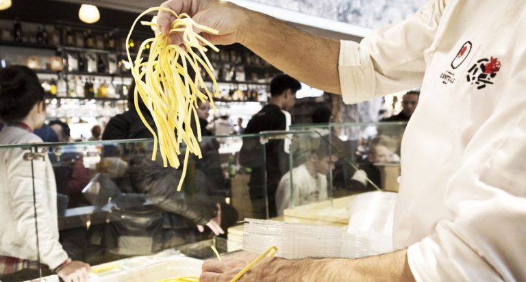
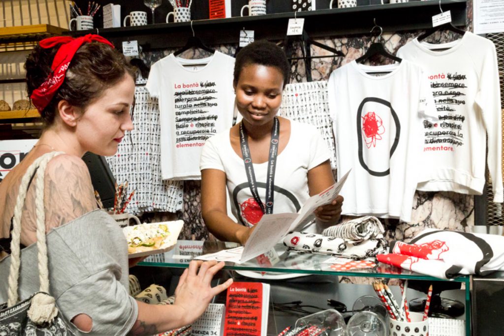
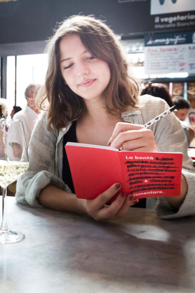
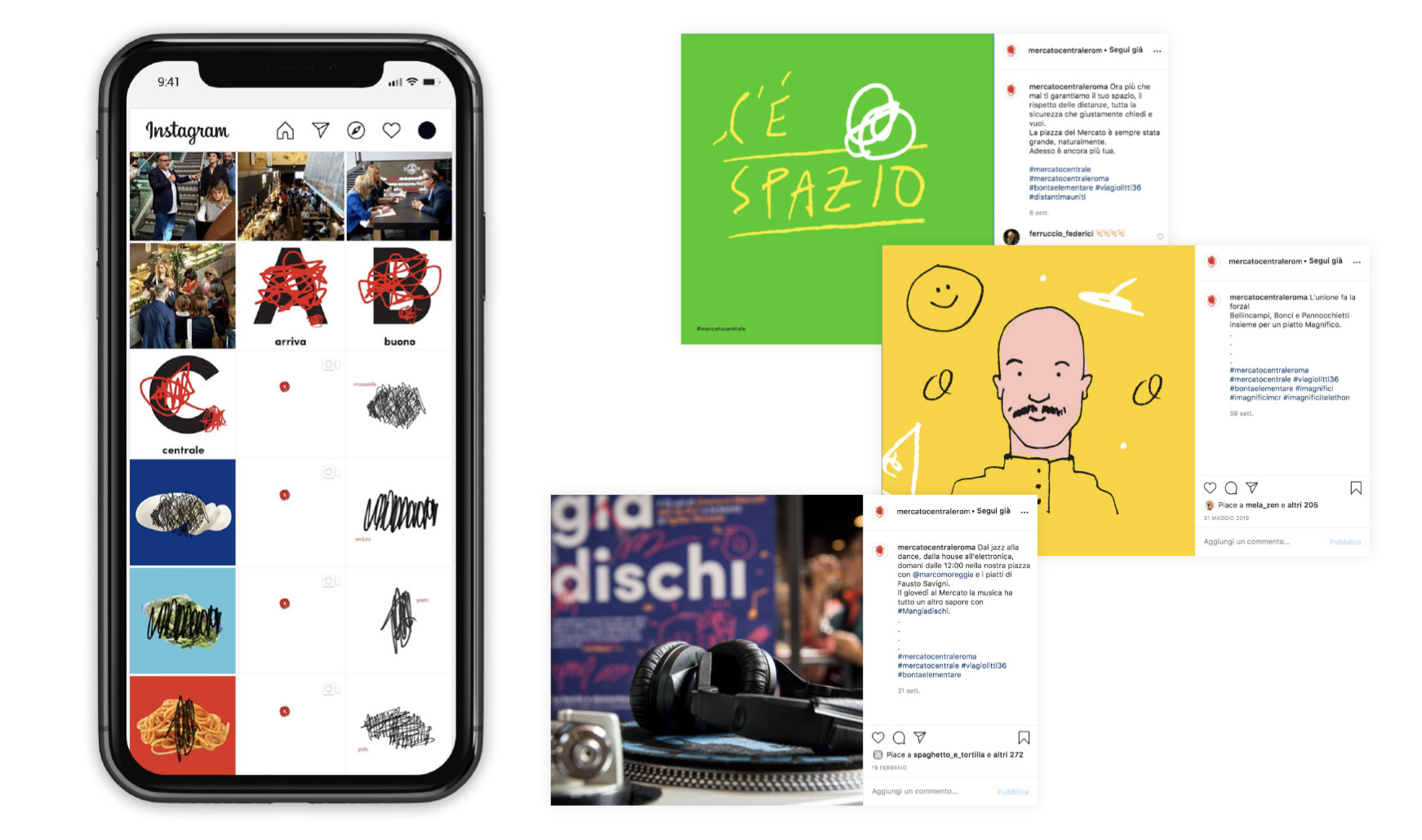
The opening of Mercato Centrale of Rome has a precise goal: showing a new way to talk about food. For this reason, in the launch campaign we re-started from the basics: the spelling book. New signs, handwritten to build an ideal link with artisanship, the very soul of Mercato. Just a few words, the essential ones, no useless crowding of letters and repetitions. The opening’s announcement becomes a broken down sentence, to read while it surfaces from erasures that cut down the too-much. The meaning is essential. Innovative, unique, unrepeatable.

Come on, let’s go!

The doodle narrates the opening, but talks about the protagonists of Mercato, too: the artisans with their shops and products. In the support campaign that we planned and realized in- and outside melt together and the shops’ signs become ads pages. No need for product pictures: If tastiness is simple, there is no need for stories, but the will to try it personally.

Discover Mercato.

The style involves and customises each communication element starting from the media dedicated to the events of Mercato. The narration is personalized in every single detail allowing the character and unicity of Mercato Centrale of Rome to emerge.

A moving identity.

The dynamic ADS particularly honours the trait of Mercato. All the elements in the composition, colours and doodles, are recognizable and grab attention.

Sign and layout symbol.

The doodle is the distinctive trait on all media and becomes the very identity of Mercato Centrale of Rome, from the setting up of the space to the personalization of both shops and passageways. The glass stairs turn into the ideal palette to interact playfully with people going up and down. The lift is the support that reiterates the centrality of the concept: tastiness is simple.

In store, let’s communicate.

The visual and conceptual language of Mercato Centrale of Rome drives the planning, study and expression on all the media. Ad hoc planning and designing build a strong identity.
Unmistakable.

Wearing a story.

The uniforms of the staff, partners and artisans are original and personalised, in order to make each protagonist of Mercato Centrale of Rome unique and recognisable.

Away, with you.

What if anyone likes what they sell at Mercato? They can buy It. T-shirts, water bottles, shopping bags, pens, mugs and notebooks: everything speaks the language of Mercato.

Come on, click!

We created, took care and followed the website for Mercato Centrale Roma. From the first planning of the dedicated page, to the realization of posts, stories, animated videos and special projects. Content creation and image coordination activities for the digital channels of Mercato Centrale Roma are keeping us busy, every day.

E dai, vieni!

take a tour of our fadvorites